


- Cebollas Póster
- Rábanos Póster
- Pareja bailando en la nieve Póster
- Jet Clipper a Hawái Póster
- Campari Soda Póster
- Bec-Kina Póster
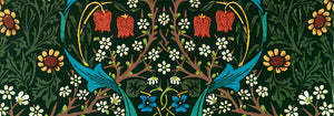
- Strawberry Thief Póster
- Figuras danzantes de Matisse Póster
- Exposición Tom Krojer Póster
- Escena callejera de Berlín Póster
- Exposición de Ernst Kirchner Póster
- Parque cerca de Lu Póster
- El Comienzo Póster
- Twilight’s Ring Póster
- Parler Seul Póster
- Fauno y Ninfa Póster
- The Dream Póster
- Le Concert Póster
- Mujer y pájaro en la noche Póster
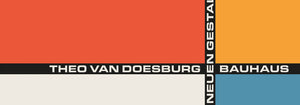
- Bauhaus 20 Póster
- Bauhaus 21 Póster
- Come más frutas Póster
- Snoopy Come Home Póster
- To London by Jet Clipper Póster
- Kyushu-Okinawa Póster
- Jerez Pedro Domecq Póster
- Balsam Aperitif Póster
- Mantequilla Póster
- Crans Póster
- Monte Carlo Póster
- Pacific Vibrations Póster
- Continental Hawaii Airline Póster
- Gato negro 4 Póster
- Gato negro 3 Póster
- Cerveza y cigarrillo Póster
-
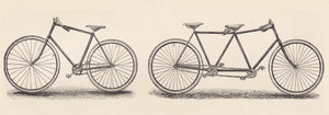
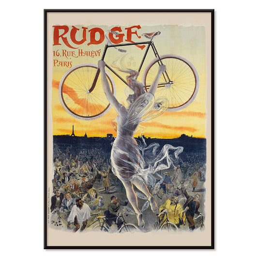
Rudge Póster
Jean de Paleologue · 1898 · Póster Art Nouveau con musa alada elevando una bicicleta reluciente sobre la multitud
Póster desde €9 · Enmarcado desde €16
Precio habitual A partir de €6,00Precio habitual -
Vivaudou Mavis Póster
Fred L. Parker · 1920 · Glamoroso póster Art Deco de perfume con figura elegante y frascos en tonos joya
Póster desde €9 · Enmarcado desde €16
Precio habitual A partir de €6,00Precio habitual -
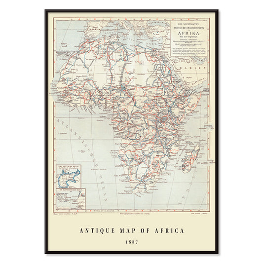
Mapa antiguo de África Póster
Institute of Leipzig · 1851 · Detallada lámina vintage de África con coordenadas en cuadrícula y topónimos densos
Póster desde €9 · Enmarcado desde €16
Precio habitual A partir de €6,00Precio habitual -
Mapamundi Póster
Josep Paluzie Lucena · 1900 · Póster vintage detallado del mapamundi con océanos azules y papel beige cálido
Póster desde €9 · Enmarcado desde €16
Precio habitual A partir de €6,00Precio habitual -
Doves No. 2 Póster
Hilma af Klint · 1915 · Lírico póster de lámina artística abstracta con simbolismo de paloma y formas geométricas en tonos pastel
Póster desde €9 · Enmarcado desde €16
Precio habitual A partir de €6,00Precio habitual -
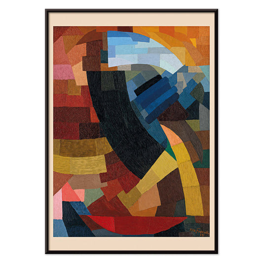
Fragmentos de figura Póster
Otto Freundlich · 1928 · Vibrante póster geométrico de figura fragmentada con gruesos contornos negros
Póster desde €9 · Enmarcado desde €16
Precio habitual A partir de €6,00Precio habitual -
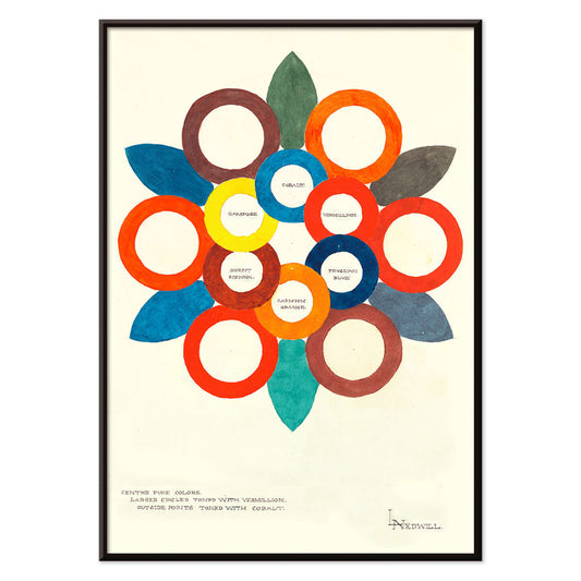
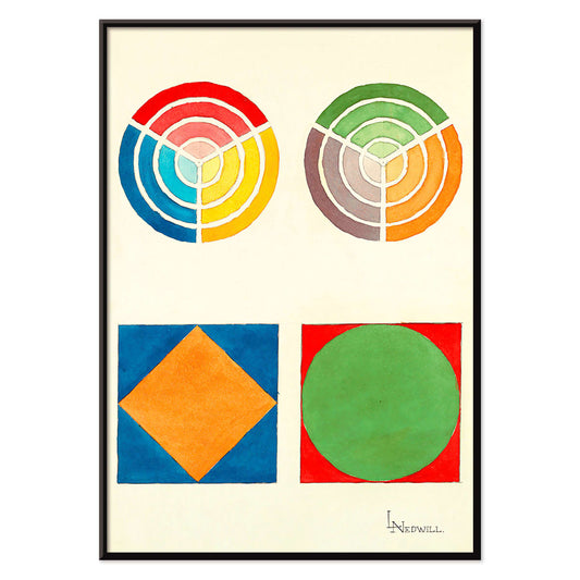
Centre Pure Colors Póster
Elizabeth A. Nedwill · 1900 · Póster abstracto de rueda de color con anillos superpuestos en tonos cálidos y fríos
Póster desde €9 · Enmarcado desde €16
Precio habitual A partir de €6,00Precio habitual -
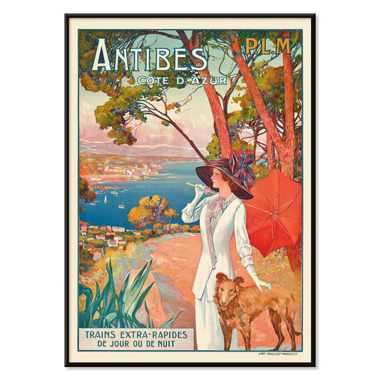
Antibes Póster
David Dellepiane · 1910 · Póster Belle Époque de Antibes con mujer elegante y perro sobre la costa mediterránea
Póster desde €9 · Enmarcado desde €16
Precio habitual A partir de €6,00Precio habitual -
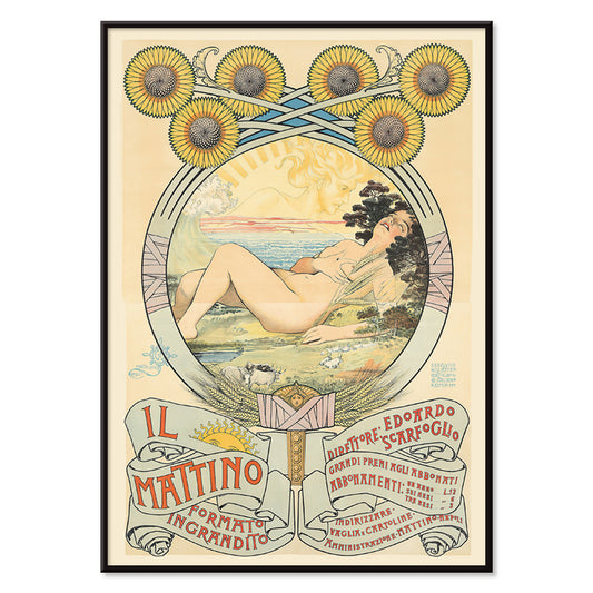
Il Mattino Póster
Giovanni Mataloni · 1896 · Lírica lámina Art Nouveau de mujer recostada enmarcada por girasoles radiantes
Póster desde €9 · Enmarcado desde €16
Precio habitual A partir de €6,00Precio habitual -
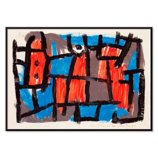
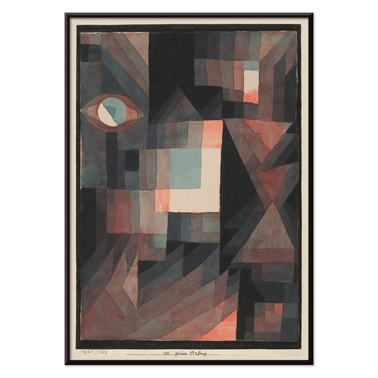
The Hour Before One Night Póster
Paul Klee · 1940 · Póster abstracto onírico con líneas negras y formas rojas y azules sobre fondo apagado
Póster desde €9 · Enmarcado desde €16
Precio habitual A partir de €6,00Precio habitual -
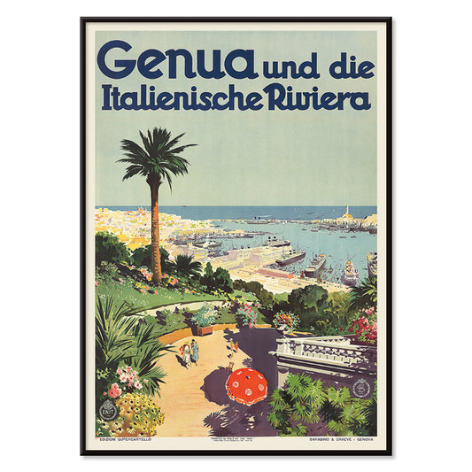
Génova Póster
Aurelio Craffonara · 1931 · Póster de puerto de Génova bañado de sol con barcos estilizados y siluetas costeras nítidas
Póster desde €9 · Enmarcado desde €16
Precio habitual A partir de €6,00Precio habitual -
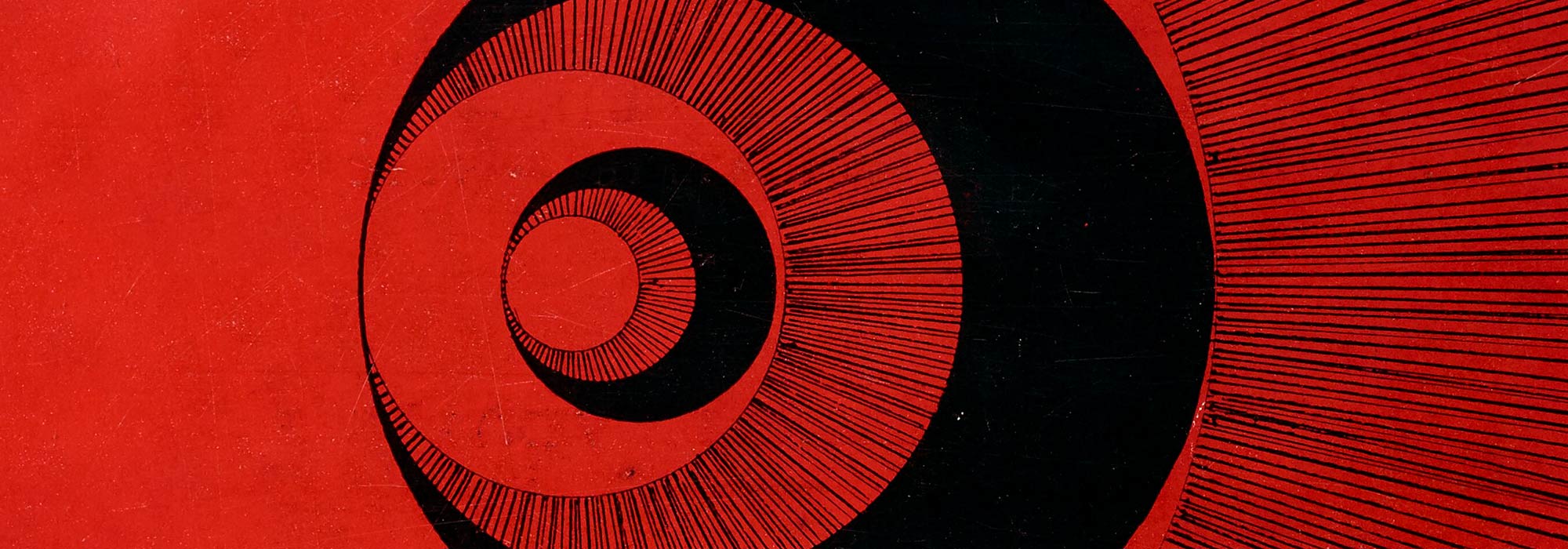
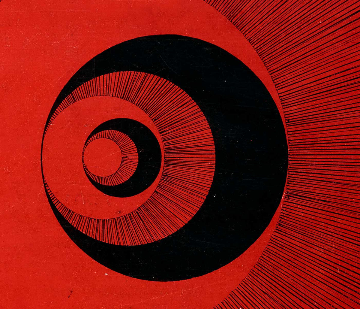
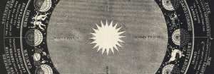
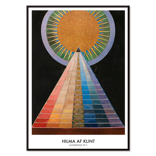
Retablo No. 1 Póster
Hilma af Klint · 1915 · Brillante lámina artística geométrica con motivo solar central y formas contundentes sobre fondo negro
Póster desde €9 · Enmarcado desde €16
Precio habitual A partir de €6,00Precio habitual -
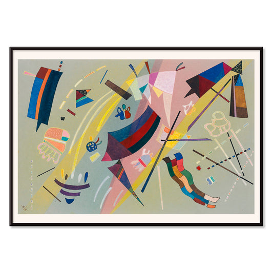
Sans Titre Póster
Wassily Kandinsky · 1941 · Póster lírico abstracto con motivos geométricos flotantes en azul, amarillo, rosa y rojo
Póster desde €9 · Enmarcado desde €16
Precio habitual A partir de €6,00Precio habitual -
Cada uno con su estilo Póster
McRay Magleby · 1942 · Póster geométrico y desenfadado que celebra la individualidad con vivos bloques de color
Póster desde €9 · Enmarcado desde €16
Precio habitual A partir de €6,00Precio habitual -
Gradación roja y verde Póster
Paul Klee · 1921 · Póster modernista abstracto con bloques degradados rojos y verdes y finas líneas negras
Póster desde €9 · Enmarcado desde €16
Precio habitual A partir de €6,00Precio habitual -
The Seafarer Póster
Paul Klee · 1923 · Juguetón póster abstracto marinero con símbolos rítmicos que evocan música y viaje oceánico
Póster desde €9 · Enmarcado desde €16
Precio habitual A partir de €6,00Precio habitual -
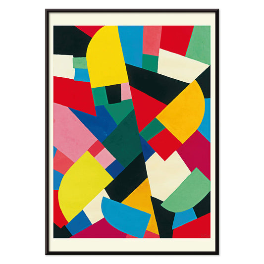
Área fragmentada por perpendiculares Póster
Joseph Schillinger · 1934 · Lámina artística geométrica con rejillas perpendiculares y bloques de color vivos en equilibrio rítmico
Póster desde €9 · Enmarcado desde €16
Precio habitual A partir de €6,00Precio habitual -
Composition Abstraite Póster
Otto Freundlich · 1937 · Vibrante lámina artística geométrica de bloques de color entrelazados con contornos negros
Póster desde €9 · Enmarcado desde €16
Precio habitual A partir de €6,00Precio habitual -
Komposition Póster
Otto Freundlich · 1936 · Vibrante lámina artística geométrica con planos de color entrelazados y energía modernista
Póster desde €9 · Enmarcado desde €16
Precio habitual A partir de €6,00Precio habitual -
Diseño Osnovnoye Póster
Gustavs Klucis · 1920 · póster constructivista dinámico con tipografía cirílica y formas geométricas rojas contundentes
Póster desde €9 · Enmarcado desde €16
Precio habitual A partir de €6,00Precio habitual -
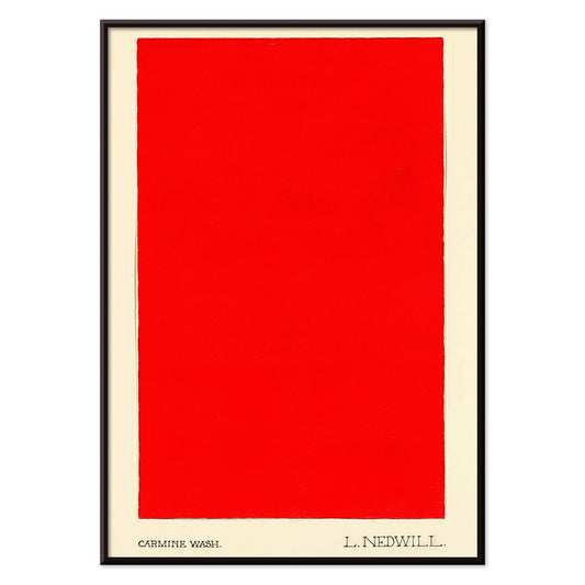
Carmine Wash Póster
Elizabeth A. Nedwill · 1900 · Lámina artística minimalista con un solo bloque carmín flotando sobre marfil
Póster desde €9 · Enmarcado desde €16
Precio habitual A partir de €6,00Precio habitual -
Adorno histórico Póster
Elizabeth A. Nedwill · 1900 · Lámina vintage geométrica y vívida que armoniza motivo histórico y ritmo moderno
Póster desde €9 · Enmarcado desde €16
Precio habitual A partir de €6,00Precio habitual -
Patchwork de color Póster
Otto Freundlich · 1936 · Póster abstracto vibrante con teselas de color entrelazadas y contornos negros gruesos
Póster desde €9 · Enmarcado desde €16
Precio habitual A partir de €6,00Precio habitual -
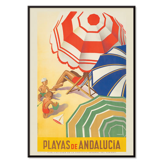
Playas de Andalucía Póster
José Morell · 1939 · Vibrante póster andaluz de playa con bañistas, mar azul, barcos y tipografía contundente
Póster desde €9 · Enmarcado desde €16
Precio habitual A partir de €6,00Precio habitual -
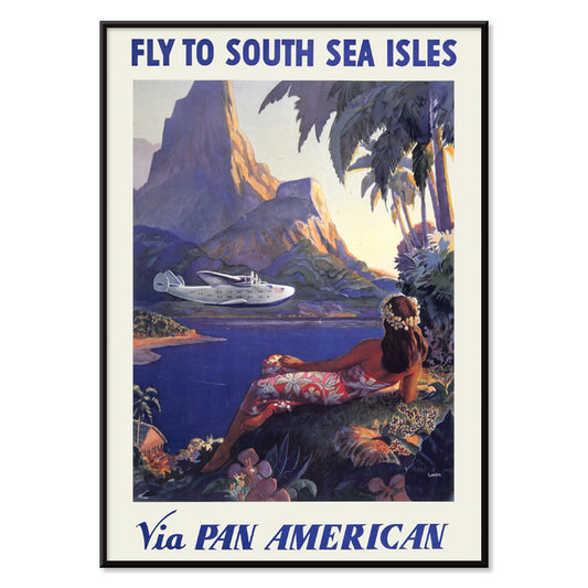
Vuela a las islas del Mar del Sur vía Pan American Póster
Paul George Lawler · 1938 · Póster de viaje vibrante de las islas Mar del Sur con hidroavión Pan Am y costa tropical
Póster desde €9 · Enmarcado desde €16
Precio habitual A partir de €6,00Precio habitual -
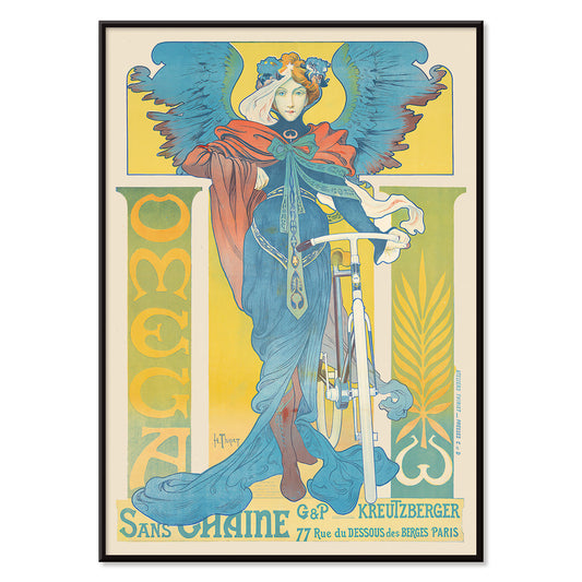
Omega Póster
Henri Thiriet · 1897 · Póster Art Nouveau con bicicleta y mujer alada en tonos azules
Póster desde €9 · Enmarcado desde €16
Precio habitual A partir de €6,00Precio habitual -
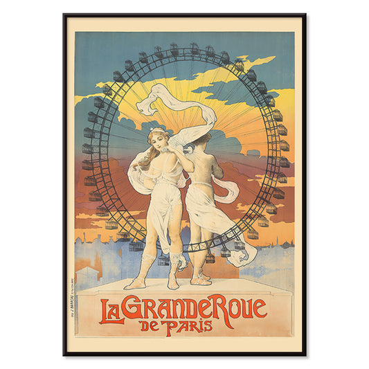
La Grande Roue Póster
Artista desconocido · 1899 · Póster Belle Époque de París con mujeres elegantes frente a la noria al atardecer
Póster desde €9 · Enmarcado desde €16
Precio habitual A partir de €6,00Precio habitual -
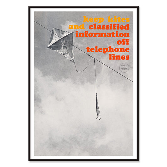
Fuera de las líneas telefónicas Póster
Artista desconocido · 1964 · Póster de seguridad contundente con un cometa enredado en líneas telefónicas en blanco y negro
Póster desde €9 · Enmarcado desde €16
Precio habitual A partir de €6,00Precio habitual -
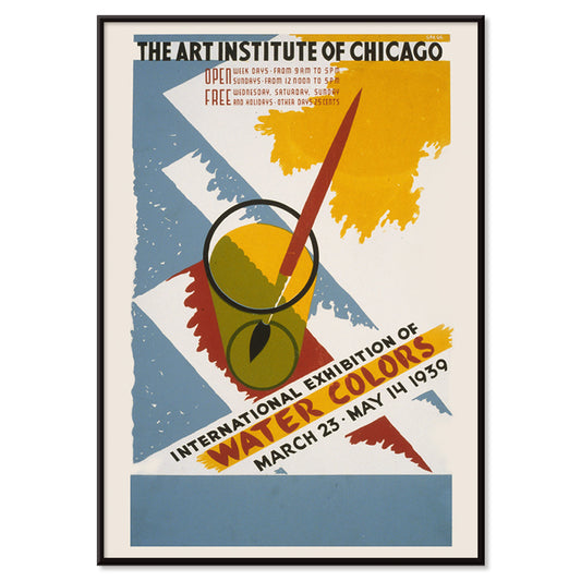
Exposición internacional de acuarelas Póster
Arlington Gregg · 1939 · póster de exposición gráfico con bloques de colores primarios y un pincel en un vaso
Póster desde €9 · Enmarcado desde €16
Precio habitual A partir de €6,00Precio habitual -
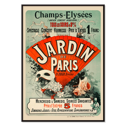
Jardín de París Póster
Jules Chéret · 1884 · Alegre póster de la Belle Époque con bailarina giratoria, máscaras y flores en confeti
Póster desde €9 · Enmarcado desde €16
Precio habitual A partir de €6,00Precio habitual -
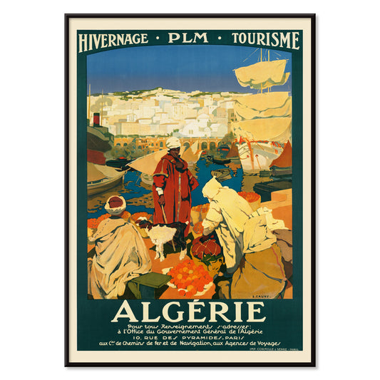
Algérie Póster
Léon Cauvy · 1930 · Vibrante póster de puerto argelino con tipografía audaz y atmósfera mediterránea bañada de sol
Póster desde €9 · Enmarcado desde €16
Precio habitual A partir de €6,00Precio habitual -
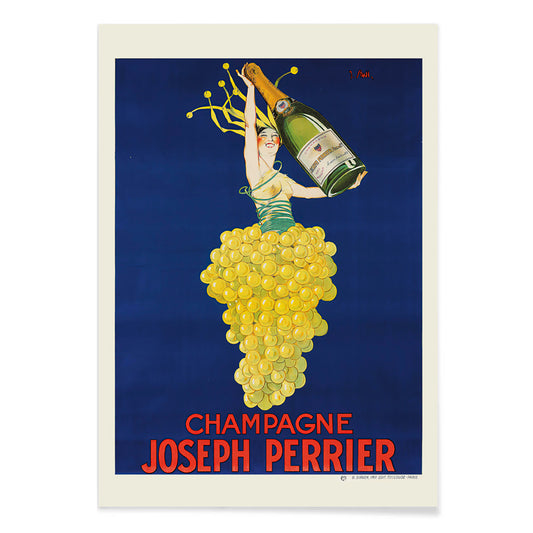
Champagne Joseph Perrier Póster
Joseph Stall · 1902 · Festivo póster de champán con figura elegante y motivos de uvas en colores vivos
Póster desde €9 · Enmarcado desde €16
Precio habitual A partir de €6,00Precio habitual -
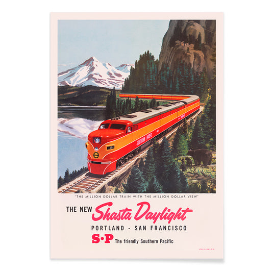
Shasta Daylight Portland – San Francisco Póster
Artista desconocido · 1950 · Póster de tren rojo estilizado curvándose por un paisaje montañoso en gráficos nítidos de mediados de siglo
Póster desde €9 · Enmarcado desde €16
Precio habitual A partir de €6,00Precio habitual -
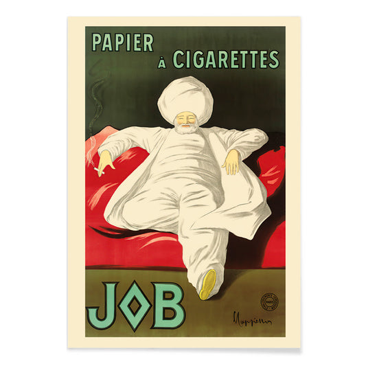
Papel para liar Póster
Leonetto Cappiello · 1933 · Elegante póster publicitario con figura de túnica blanca sobre intenso verde
Póster desde €9 · Enmarcado desde €16
Precio habitual A partir de €6,00Precio habitual -
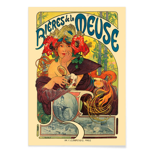
Bières De La Meuse Póster
Alphonse Mucha · 1897 · Radiante póster Art Nouveau de cerveza con musa coronada de flores y cabello ondulado
Póster desde €9 · Enmarcado desde €16
Precio habitual A partir de €6,00Precio habitual -
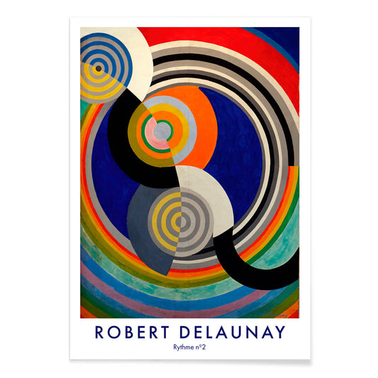
Rythme n°2 Póster
Robert Delaunay · 1938 · Lámina artística rítmica de círculos entrelazados y arcos en primarios vibrantes
Póster desde €9 · Enmarcado desde €16
Precio habitual A partir de €6,00Precio habitual


36/761 items
- Rudge Póster
- Vivaudou Mavis Póster
- Mapamundi Póster
- Doves No. 2 Póster
- Fragmentos de figura Póster
- Centre Pure Colors Póster
- Antibes Póster
- Génova Póster
- Retablo No. 1 Póster
- Sans Titre Póster
- Cada uno con su estilo Póster
- Área fragmentada por perpendiculares Póster
- Komposition Póster
- Carmine Wash Póster
- Adorno histórico Póster
- Patchwork de color Póster
- Playas de Andalucía Póster
- Vuela a las islas del Mar del Sur vía Pan American Póster
- La Grande Roue Póster
- Fuera de las líneas telefónicas Póster
- Jardín de París Póster
- Champagne Joseph Perrier Póster
- Shasta Daylight Portland – San Francisco Póster
- Papel para liar Póster
- Rythme n°2 Póster
Rojo, el acento más intencionado
En la colección Rojo, el color actúa menos como tema que como señal: un sello amapola, un titular lacado, un rubor cálido sobre papel. Estos pósters transitan entre la ilustración, el modernismo, los gráficos de viaje y las láminas diagramáticas, y aun así cada uno depende del rojo para dirigir la atención. Bermellón sobre crema, ladrillo contra grafito o una única forma escarlata en un espacio sereno puede cambiar la lectura de una habitación. Como arte mural, el rojo funciona como un condimento en la decoración: un pequeño acento dinamiza una galería de pared, mientras que un campo mayor establece un punto focal y una sensación de dirección en la composición.
Oficio, pigmento y el arte de persuadir
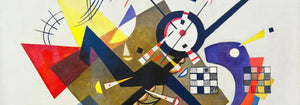
El rojo ha llevado peso técnico y cultural a lo largo de la historia gráfica. Tinturas y pigmentos antiguos como la cochinilla y la rubia marcaron textiles y artes decorativas, mientras que la litografía situó la tipografía roja y los campos planos de color en el centro de la cultura visual pública. Strawberry Thief (1883) de William Morris emplea el rojo como nota estructural dentro del motivo repetido, manteniendo aves y frutos en tensión rítmica. En Hygieia (1907) de Gustav Klimt, la túnica se lee como emblema y aviso, con el carmesí actuando como borde alrededor de la figura. Heavy Red (1924) de Wassily Kandinsky presenta el rojo como masa, un plano que empuja las formas adyacentes hacia el movimiento y hace que la geometría adquiera presencia física.
Dónde mejor vive el rojo
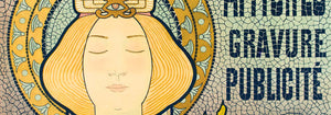
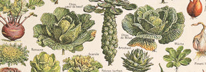
Los acentos rojos encajan con más naturalidad junto a materiales honestos: nogal, terracota, latón, lino y piedra desgastada. En cocinas y rincones de comedor, los estudios frutales y la iconografía vegetal hacen eco de los tonos de la mesa y la cerámica, por eso las impresiones de Botánica son compañeras fáciles de una decoración dominada por el rojo. En pasillos y entradas, un elemento rojo y rotundo ayuda a guiar la mirada por un espacio angosto; la lógica gráfica de la Publicidad funciona bien con espejos, percheros y suelos más oscuros. Para dormitorios, conviene mantener el rojo en dosis pequeñas y cálidas, inclinándose hacia el ladrillo o el rosa viejo en lugar del escarlata primario, y equilibrarlo con ropa de cama pálida y una luz ámbar baja. Si la estancia se abre a zonas verdes, el rojo se convierte en un contrapunto claro; escenas más sosegadas de Paisajes ayudan a mantener la paleta anclada.
Combinaciones, enmarcado y creación de una galería
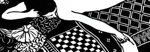
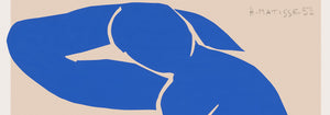
Para evitar que el rojo domine, trátalo como una voz dentro de una paleta medida. Un paspartú blanco da aire al rojo, mientras que un marco negro fino afila las zonas saturadas y hace eco de la disciplina de la imagen en Blanco y Negro. Para emparejamientos estructurados, coloca un póster liderado por el rojo junto a trabajos geométricos de Bauhaus, donde el rojo suele aparecer como bloque controlado más que como adorno. En un registro más teatral, Cachou Lajaunie (1920) de Leonetto Cappiello actúa como farola frente a maderas profundas y paredes apagadas. Al organizar una galería, repite el rojo dos veces, una como área mayor y otra como pequeño acento, para que la mirada tenga un recorrido claro entre las láminas.
Una reflexión final sobre el rojo
El rojo también es una pista útil para leer imágenes: en los gráficos de viaje señala calor, vida nocturna y apetito; en la composición modernista marca el punto donde la atención errante se fija. Por eso esta selección puede saltar del patrón a la figura simbolista o a la abstracción de bordes duros sin perder coherencia. Deja espacio alrededor del campo rojo más ruidoso y permite que las láminas vecinas lleven tonos más tranquilos como arena, tinta y verde vidrio marino. Usado así, el rojo se vuelve ritmo en lugar de ruido, y la decoración empieza a sentirse intencional sin volverse rígida.