


- Destruye a este bruto enloquecido Póster
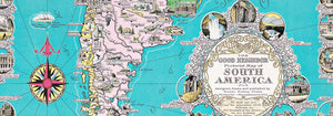
- El buen vecino de Sudamérica Póster
- Italia y Ciudad del Vaticano Póster
- Les Lalanne Póster
- Pareja bailando en la nieve Póster
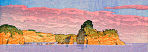
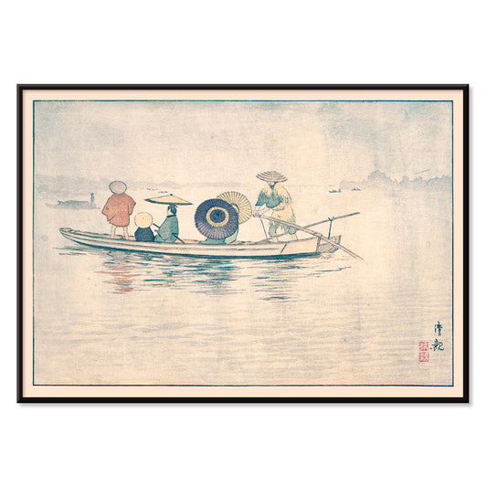
- Jet Clipper a Hawái Póster
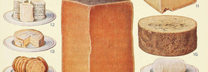
- Kohler Chocolat Póster
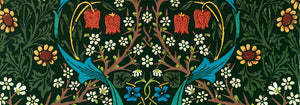
- Strawberry Thief Póster
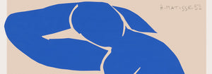
- Figuras danzantes de Matisse Póster
- Exposición Tom Krojer Póster
- Escena callejera de Berlín Póster
- Exposición de Ernst Kirchner Póster
- Mujer sentada de espaldas Póster
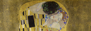
- Cabello rojo y sombrero azul Póster
- Parque cerca de Lu Póster
- El Comienzo Póster
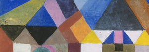
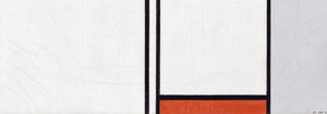
- Formas abstractas Parler Seul 2 Póster
- Twilight’s Ring Póster
- Parler Seul Póster
- The Dream Póster
- Le Concert Póster
- Artista femenina Póster
- Venganza de Pink Panther Póster
- Mujer y pájaro en la noche Póster
- Visit Puerto Rico Póster
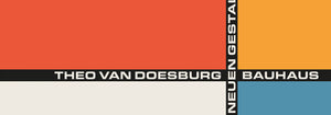
- Bauhaus 20 Póster
- Bauhaus 21 Póster
- Come más frutas Póster
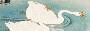
- Grulla japonesa azul Póster
- Snoopy Come Home Póster
- To London by Jet Clipper Póster
- Crans Póster
- Monte Carlo Póster
- Pacific Vibrations Póster
- Continental Hawaii Airline Póster
- Cerveza y cigarrillo Póster
- Costa Oeste de México Póster
-
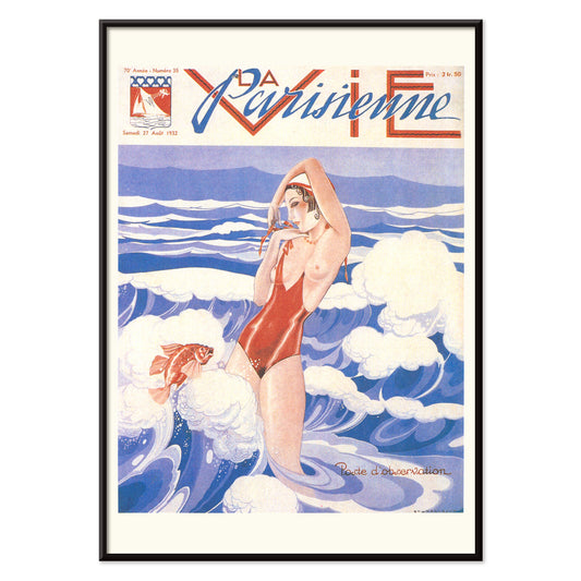
La Vie Parisienne Póster
Umberto Brunelleschi · 1932 · Póster Art Deco con mujer segura en bañador rojo sobre fondo azul y blanco
Póster desde €9 · Enmarcado desde €16
Precio habitual A partir de €6,00Precio habitual -
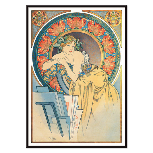
Mujer con amapolas Póster
Alphonse Mucha · 1899 · Elegante póster Art Nouveau con mujer serena rodeada de amapolas rojas vivas
Póster desde €9 · Enmarcado desde €16
Precio habitual A partir de €6,00Precio habitual -
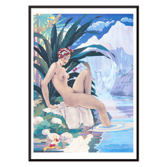
Paul et Virginie por B. de Saint-Pierre Póster
Umberto Brunelleschi · 1940 · Sensual póster Art Deco con desnudo recostado enmarcado por palmeras tropicales
Póster desde €9 · Enmarcado desde €16
Precio habitual A partir de €6,00Precio habitual -
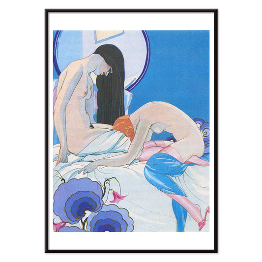
Les Aventures du Roi Pausole Póster
Umberto Brunelleschi · 1935 · Póster Art Deco erótico con figura elegante en azul frío y rosa suave
Póster desde €9 · Enmarcado desde €16
Precio habitual A partir de €6,00Precio habitual -
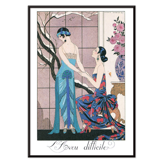
L’aveu Difficile Póster
George Barbier · 1924 · Póster de moda Art Deco con figuras elegantes y teatralidad en tonos joya
Póster desde €9 · Enmarcado desde €16
Precio habitual A partir de €6,00Precio habitual -
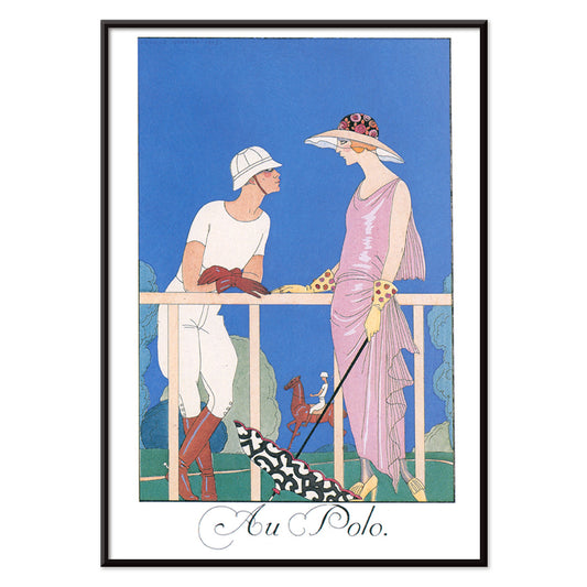
Au Polo Póster
George Barbier · 1924 · Elegante póster Art Déco de polo con siluetas estilizadas y contrastes cromáticos refinados
Póster desde €9 · Enmarcado desde €16
Precio habitual A partir de €6,00Precio habitual -
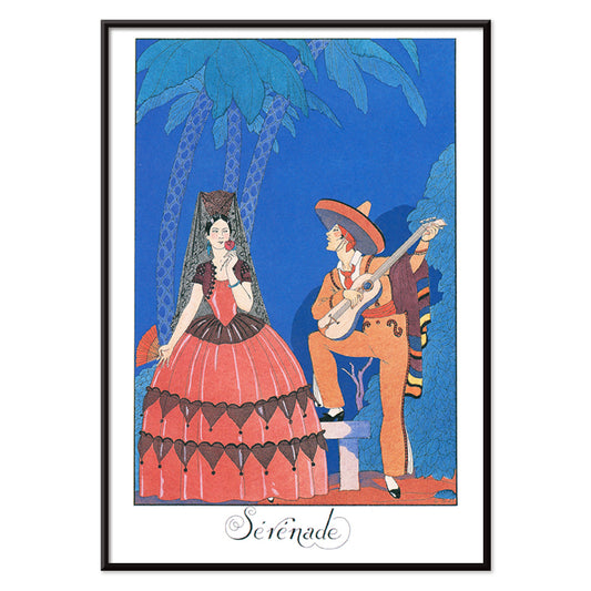
Sérénade Póster
George Barbier · 1924 · Elegante póster Art Deco con músico vestido de azul serenando a mujer en naranja
Póster desde €9 · Enmarcado desde €16
Precio habitual A partir de €6,00Precio habitual -
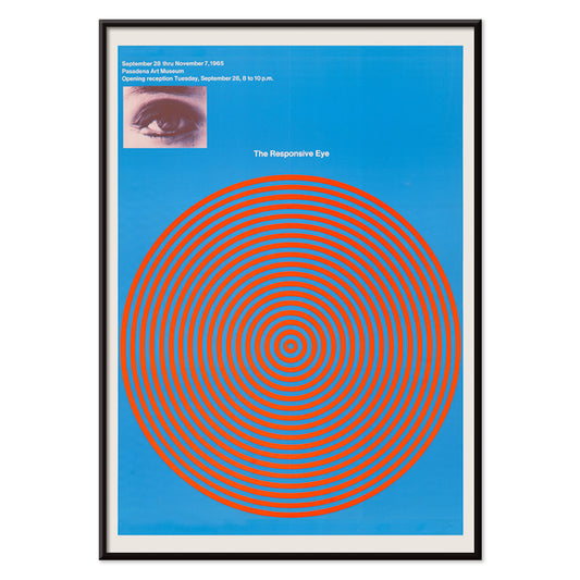
The Responsive Eye Póster
Patrick Blackwell · 1965 · Póster Op art con círculos concéntricos rojos y un ojo fijo sobre fondo azul
Póster desde €9 · Enmarcado desde €16
Precio habitual A partir de €6,00Precio habitual -
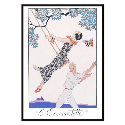
L’Escarpotette Póster
George Barbier · 1924 · Juguetón póster Art Deco de figura chic en un columpio en azul
Póster desde €9 · Enmarcado desde €16
Precio habitual A partir de €6,00Precio habitual -
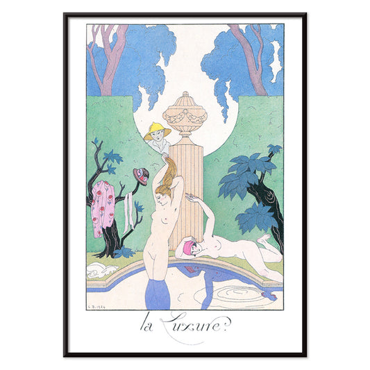
La Luxure Póster
George Barbier · 1924 · Lámina Art Déco sensual con figuras desnudas estilizadas enmarcadas por motivos de jardín frondoso
Póster desde €9 · Enmarcado desde €16
Precio habitual A partir de €6,00Precio habitual -
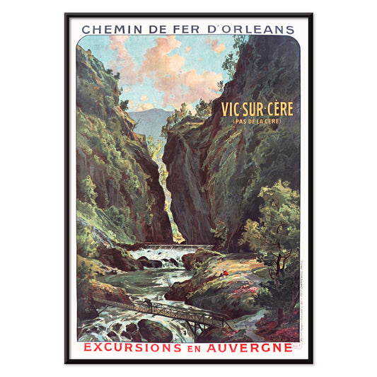
Vic-sur-Cère Póster
Louis Tauzin · 1905 · Refinado póster de viaje francés con la garganta y el río de Vic-sur-Cère en Auvernia
Póster desde €9 · Enmarcado desde €16
Precio habitual A partir de €6,00Precio habitual -
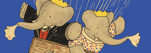
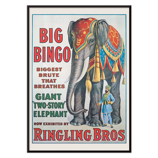
Big Bingo Póster
Artista desconocido · 1916 · Vibrante póster de circo con un elefante imponente junto a su entrenador
Póster desde €9 · Enmarcado desde €16
Precio habitual A partir de €6,00Precio habitual -
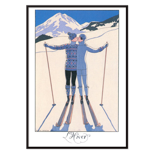
L’Hiver Póster
George Barbier · 1924 · Romántico póster Art Déco con pareja abrazándose en un nítido paisaje invernal
Póster desde €9 · Enmarcado desde €16
Precio habitual A partir de €6,00Precio habitual -
L'Eau Póster
George Barbier · 1924 · Elegante póster Art Déco de ocio ribereño en azul vivo con acentos rosa
Póster desde €9 · Enmarcado desde €16
Precio habitual A partir de €6,00Precio habitual -
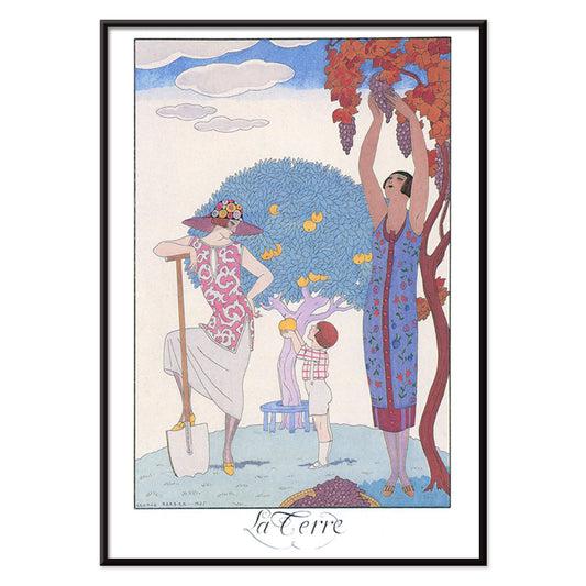
La Terre Póster
George Barbier · 1924 · Elegante póster Art Decó con mujeres y niño cosechando fruta en jardín estilizado
Póster desde €9 · Enmarcado desde €16
Precio habitual A partir de €6,00Precio habitual -
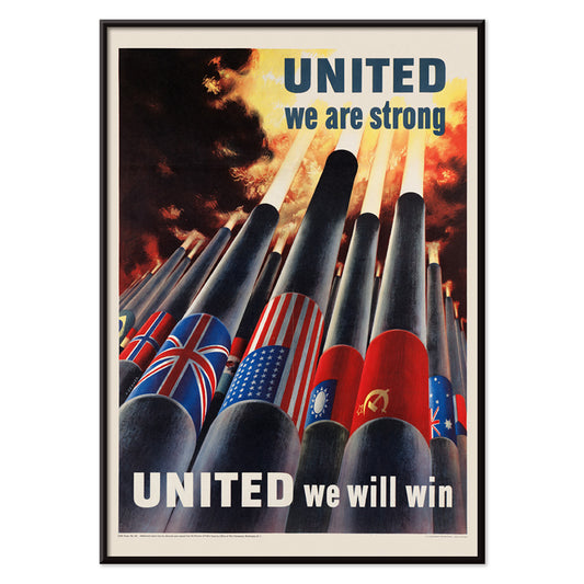
Unidos somos fuertes Póster
Henry Koerner · 1943 · Póster de la Segunda Guerra Mundial con banderas aliadas sobre cañones en estilo gráfico contundente
Póster desde €9 · Enmarcado desde €16
Precio habitual A partir de €6,00Precio habitual -
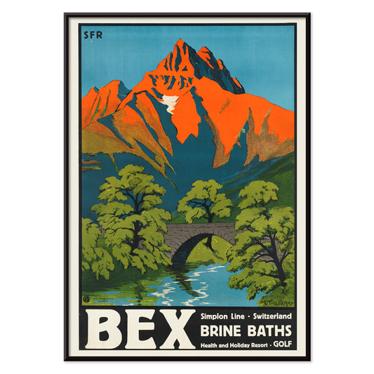
Baños de salmuera de Bex Póster
Aime-Felix Nicollerat · 1896 · Póster de balneario alpino con puente de piedra, río impetuoso y cumbres radiantes
Póster desde €9 · Enmarcado desde €16
Precio habitual A partir de €6,00Precio habitual -
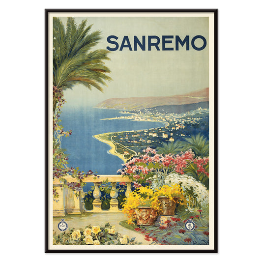
Sanremo Póster
Artista desconocido · 1920 · Póster de viaje de Sanremo iluminado por el sol con flores, palmeras y bahía mediterránea
Póster desde €9 · Enmarcado desde €16
Precio habitual A partir de €6,00Precio habitual -
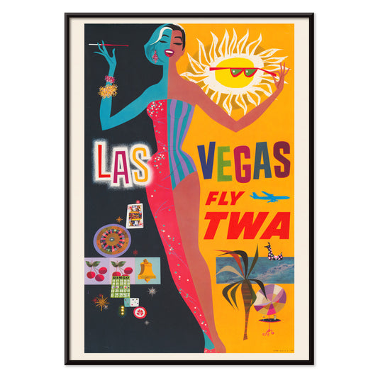
Las Vegas – Fly TWA Póster
David Klein · 1962 · Vibrante póster de viaje de Las Vegas con bailarina de cabaret, neones y aire TWA
Póster desde €9 · Enmarcado desde €16
Precio habitual A partir de €6,00Precio habitual -
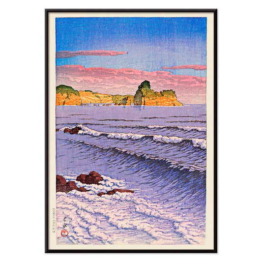
Recuerdos de mis viajes: Kojaku Cavern, península de Oga Póster
Kawase Hasui · 1940 · Sereno póster costero que muestra una cueva en acantilados oscuros sobre rompientes luminosas
Póster desde €9 · Enmarcado desde €16
Precio habitual A partir de €6,00Precio habitual -
Mar matutino de Bikuni, Shiribeshi Póster
Kawase Hasui · 1933 · Serena lámina artística shin hanga de barcos de pesca sobre aguas tranquilas y horizonte brumoso
Póster desde €9 · Enmarcado desde €16
Precio habitual A partir de €6,00Precio habitual -
Hawái por Flying Clipper Póster
Artista desconocido · 1938 · Póster de viaje de Hawái con Pan American clipper y motivo de lei acogedora
Póster desde €9 · Enmarcado desde €16
Precio habitual A partir de €6,00Precio habitual -
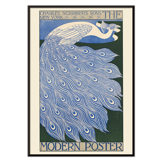
The Modern Poster Póster
Will Bradley · 1895 · Póster estilizado con pavo real y líneas Art Nouveau fluidas en azul y blanco
Póster desde €9 · Enmarcado desde €16
Precio habitual A partir de €6,00Precio habitual -
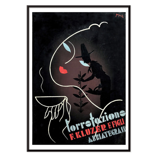
Torrefazione F.Kluzer E Figli Abbiategrasso Póster
Carlo Piquillo Pandolfi · 1930 · Póster Art Deco italiano con taza de café y bloques geométricos de color
Póster desde €9 · Enmarcado desde €16
Precio habitual A partir de €6,00Precio habitual -
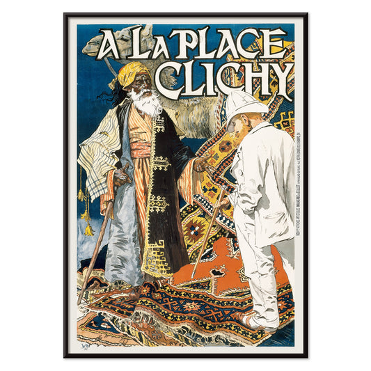
À la Place Clichy Póster
Eugène Grasset · 1891 · Póster Art Nouveau de París con una elegante mujer y paleta azul-naranja
Póster desde €9 · Enmarcado desde €16
Precio habitual A partir de €6,00Precio habitual -
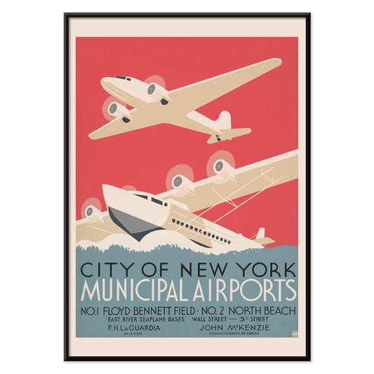
Aeropuertos municipales de la ciudad de Nueva York Póster
Artista desconocido · 1938 · Póster Art Déco aerodinámico de aeropuertos de Nueva York sobre agua y skyline estilizados
Póster desde €9 · Enmarcado desde €16
Precio habitual A partir de €6,00Precio habitual -
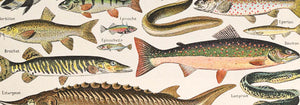
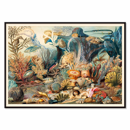
Ocean Life Póster
James M. Sommerville · 1862 · Lámina detallada de vida oceánica con corales, peces y conchas en tonos costeros luminosos
Póster desde €9 · Enmarcado desde €16
Precio habitual A partir de €6,00Precio habitual -
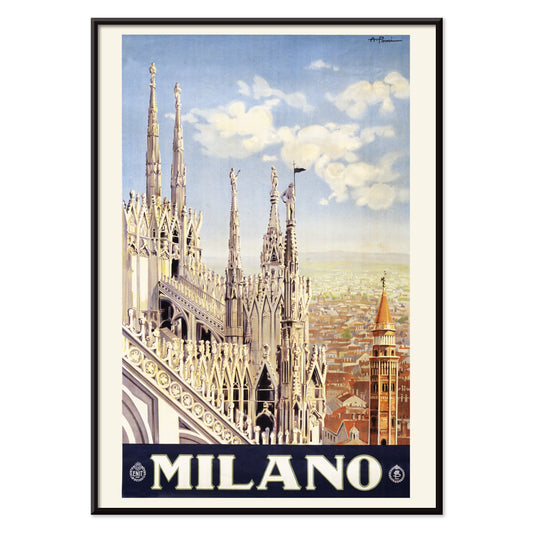
Milán Póster
Allessandro Pomi · 1920 · Estilizado póster de Milán con la silueta del Duomo bajo un cielo radiante
Póster desde €9 · Enmarcado desde €16
Precio habitual A partir de €6,00Precio habitual -
Quartier Latin Póster
Louis Rhead · 1890 · Vibrante póster Art Nouveau con una artista segura y tipografía parisina llamativa
Póster desde €9 · Enmarcado desde €16
Precio habitual A partir de €6,00Precio habitual -
Cie.Cle Transatlantique Póster
Fernand Le Quesne · 1901 · Elegante póster de barco a vapor en Argel con tipografía potente y ambiente mediterráneo
Póster desde €9 · Enmarcado desde €16
Precio habitual A partir de €6,00Precio habitual -
Ruta terrestre de China Póster
Artista desconocido · 1950 · Póster de viaje de China con templos y mapa claro de la ruta terrestre
Póster desde €9 · Enmarcado desde €16
Precio habitual A partir de €6,00Precio habitual -
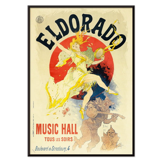
Eldorado Póster
Jules Chéret · 1894 · Enérgico póster de bailarina de cabaret con falda amarilla en remolino y tipografía Belle Époque
Póster desde €9 · Enmarcado desde €16
Precio habitual A partir de €6,00Precio habitual -
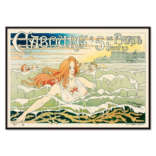
Casino de Cabourg Póster
Henri Privat-Livemont · 1896 · Póster Art Nouveau costero con nadadora pelirroja entre olas azules rítmicas
Póster desde €9 · Enmarcado desde €16
Precio habitual A partir de €6,00Precio habitual -
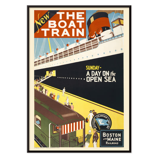
El tren al barco Póster
Charles W. Holmes · 1925 · Dinámico póster Art Deco que une un tren veloz con un transatlántico
Póster desde €9 · Enmarcado desde €16
Precio habitual A partir de €6,00Precio habitual -
Ōkawa River Bridge Póster
Kobayashi Kiyochika · 1884 · Póster ribereño lluvioso con siluetas sobre el puente y reflejos azul profundo
Póster desde €9 · Enmarcado desde €16
Precio habitual A partir de €6,00Precio habitual -
La garganta de Kiso en la nieve Póster
Hiroshige II · 1859 · Serena lámina vintage de paisaje invernal con río azul serpenteante bajo acantilados nevados
Póster desde €9 · Enmarcado desde €16
Precio habitual A partir de €6,00Precio habitual


- La Vie Parisienne Póster
- The Responsive Eye Póster
- Baños de salmuera de Bex Póster
- Sanremo Póster
- Las Vegas – Fly TWA Póster
- Recuerdos de mis viajes: Kojaku Cavern, península de Oga Póster
- Mar matutino de Bikuni, Shiribeshi Póster
- Hawái por Flying Clipper Póster
- The Modern Poster Póster
- Aeropuertos municipales de la ciudad de Nueva York Póster
- Ocean Life Póster
- El tren al barco Póster
- La garganta de Kiso en la nieve Póster
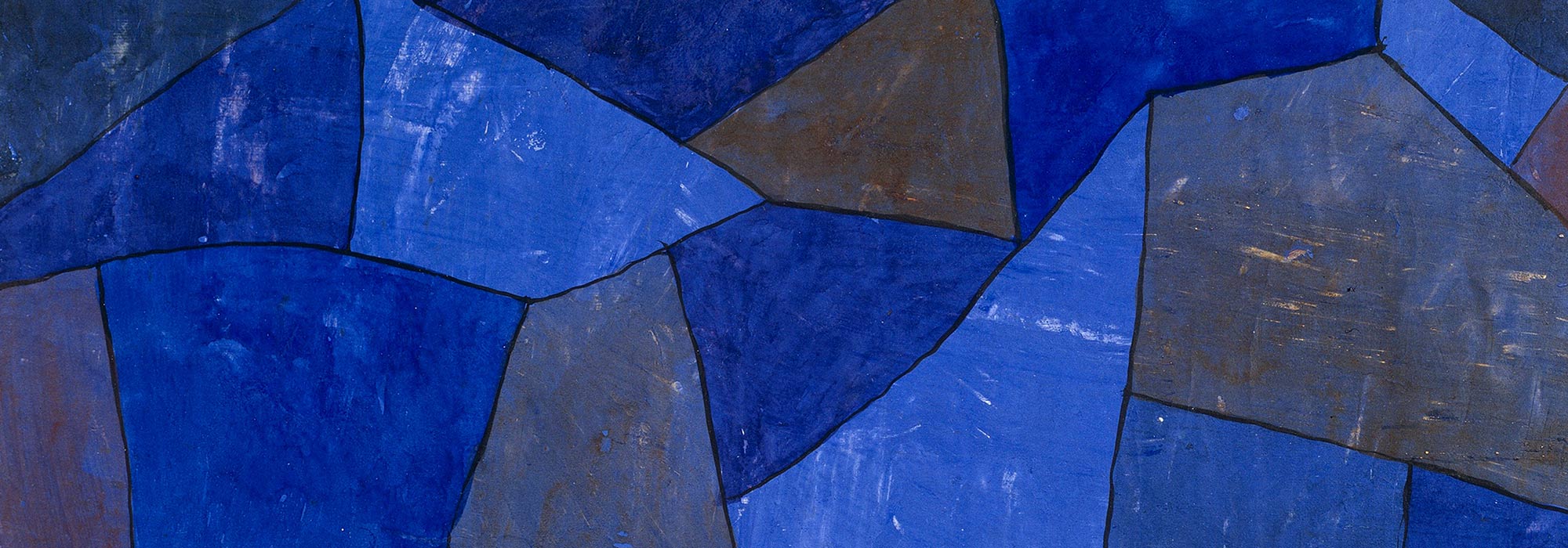
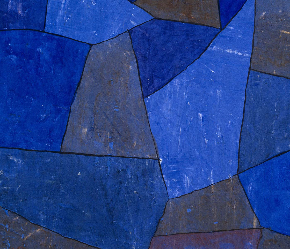
El azul como atmósfera, no solo como tono
El azul rara vez se comporta como un solo color. En el diseño de pósters vintage se convierte en distancia, tiempo, clima y profundidad, pasando de tinta prusiana a lavados de cielo pálido según cambia el tema. Esta colección entiende el azul como un elemento estructural de la decoración mural: puede enfriar una habitación, aclarar una línea y conferir al papel una sensación de archivo. Lo verás en imágenes costeras, en láminas diagramáticas y en composiciones gráficas donde el campo azul es el protagonista más que un simple fondo. Para estados de ánimo cercanos, la contención minimalista de los pósters Minimalista y el enfoque tonal de las láminas Blanco y Negro ofrecen contrapuntos nítidos.
Índigo, cianotipia y el cielo modernista
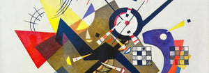
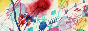
Históricamente, el azul llega tanto por tecnologías como por gusto. El índigo textil navegó entre la artesanía y la industria, mientras que la cianotipia generó imágenes fotográficas con química y luz solar, produciendo ese azul de plano inconfundible. Strawberry Thief (1883) de William Morris coloca un índigo intenso tras frutas y aves, transformando la repetición en una arquitectura doméstica que se lee a la vez como patrón y escena pictórica. La Fern (1850) cyanotype de Anna Atkins muestra cómo el mismo color actúa como evidencia: la planta aparece en silueta precisa, a medio camino entre especimen y encaje. En la abstracción moderna, Bleu de Ciel (1925) de Wassily Kandinsky usa el azul como escenario para signos flotantes, vinculando la pintura con la fascinación de la época por la música, la ciencia y la cartografía de lo invisible. Mundos afines de forma y color conviven en Abstracto y Bauhaus.
Colocar arte mural azul en la paleta del hogar
En decoración, el azul es más habitable cuando se ancla en materiales. Las maderas cálidas y los neutros arenas impiden que los azules profundos resulten fríos, mientras el acero cepillado y el vidrio aportan intención a los azules pálidos. En una entrada, una lámina azul funciona como brújula visual; en un dormitorio, adquiere calma si se repite en lino o una alfombra. En cocinas, el azul junto a azulejos blancos resulta fresco, sobre todo con motivos botánicos o cartográficos. Si buscas motivos reconocibles con énfasis azul, mira hacia Mapas, Mar y Océano y Botánica; si la estancia ya tiene color fuerte, una hoja más sencilla de Arte Clásico ayuda a mantener el equilibrio.
Curaduría: ritmo, escala y elección del marco
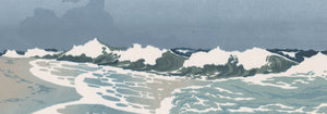
El azul facilita la curaduría porque puede unificar imágenes variadas en una pared galería. Empieza con una pieza dominante y añade una o dos compañeras más tranquilas que repitan su temperatura sin copiar el motivo. The Great Wave off Kanagawa (1830) de Hokusai es un ancla obvia: el azul de la ola no es atmosférico sino arquitectónico, construido con contornos tallados y espuma, casi como tipografía. Combínala con Morning at Cape Inubō (1931) de Kawase Hasui, donde el mar se reduce a franjas y degradados que crean una cadencia más serena. Para evitar un exceso náutico, intercala una lámina de mapa o una composición abstracta como pausa visual. Los acabados de enmarcado también orientan el ánimo: el roble claro mantiene los azules aireados, una paspartú blanca da respiro a las tintas oscuras y un marco negro fino realza el contraste; opciones disponibles en Marcos.
Azul como tinta, tinte, pigmento y dato
Lo que une estos pósters no es una era o un tema único, sino la manera en que el azul transmite información. Puede leerse como tinte artesanal, tinta de impresión, pigmento mineral o notación científica, por eso encaja en espacios que mezclan cerámica, libros y objetos de viaje sin parecer montado. Como arte mural vintage, el azul suele evocar a la vez el mar y la biblioteca: un color asociado a horizontes y al estudio. Esa tensión entre sensación y estructura es el hilo real de la colección, y lo que hace que el azul permanezca firme en la decoración diaria.