


- Cebollas Póster
- Rábanos Póster
- Pareja bailando en la nieve Póster
- Jet Clipper a Hawái Póster
- Campari Soda Póster
- Bec-Kina Póster
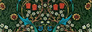
- Strawberry Thief Póster
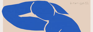
- Figuras danzantes de Matisse Póster
- Exposición Tom Krojer Póster
- Escena callejera de Berlín Póster
- Exposición de Ernst Kirchner Póster
- Parque cerca de Lu Póster
- El Comienzo Póster
- Twilight’s Ring Póster
- Parler Seul Póster
- Fauno y Ninfa Póster
- The Dream Póster
- Le Concert Póster
- Mujer y pájaro en la noche Póster
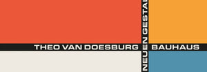
- Bauhaus 20 Póster
- Bauhaus 21 Póster
- Come más frutas Póster
- Snoopy Come Home Póster
- To London by Jet Clipper Póster
- Kyushu-Okinawa Póster
- Jerez Pedro Domecq Póster
- Balsam Aperitif Póster
- Mantequilla Póster
- Crans Póster
- Monte Carlo Póster
- Pacific Vibrations Póster
- Continental Hawaii Airline Póster
- Gato negro 4 Póster
- Gato negro 3 Póster
- Cerveza y cigarrillo Póster
-
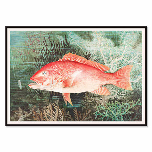
Pargo rojo del norte Póster
Samuel Kilbourne · 1861 · Detallada lámina de pargo rojo del norte con rojos vibrantes y precisión anatómica
Póster desde €9 · Enmarcado desde €16
Precio habitual A partir de €6,00Precio habitual -
Mujer aplicándose colorete Póster
Goyō Hashiguchi · 1920 · Íntima lámina artística bijin-ga de una mujer aplicándose colorete en un ritual cotidiano tranquilo
Póster desde €9 · Enmarcado desde €16
Precio habitual A partir de €6,00Precio habitual -
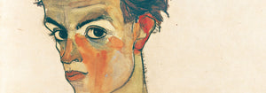
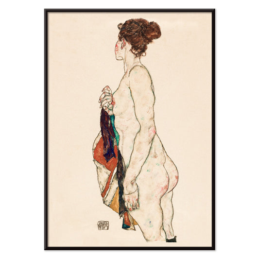
Mujer desnuda de pie Póster
Egon Schiele · 1917 · Expresiva lámina artística de desnudo de pie con trazos angulosos sobre papel beige cálido
Póster desde €9 · Enmarcado desde €16
Precio habitual A partir de €6,00Precio habitual -
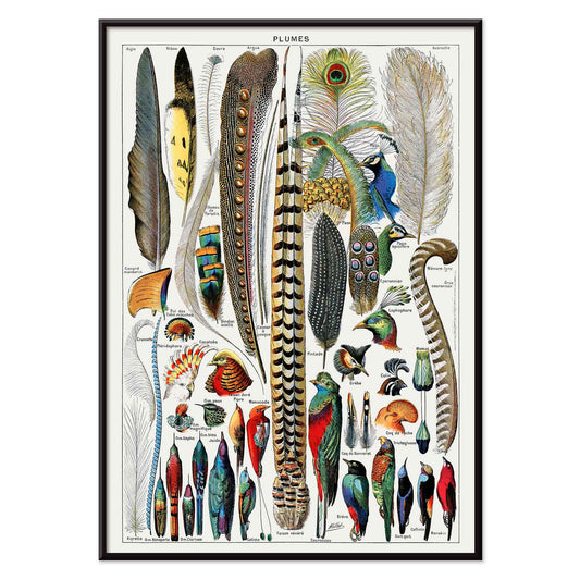
Plumas Póster
Adolphe Millot · 1900 · Lámina detallada de tipos de plumas dispuestas como tabla de especímenes con formas etiquetadas
Póster desde €9 · Enmarcado desde €16
Precio habitual A partir de €6,00Precio habitual -
Gatos Póster
Utagawa Kuniyoshi · 1849 · Luminosa lámina ukiyo-e de gatos con líneas de tinta nítidas y toques rojos
Póster desde €9 · Enmarcado desde €16
Precio habitual A partir de €6,00Precio habitual -
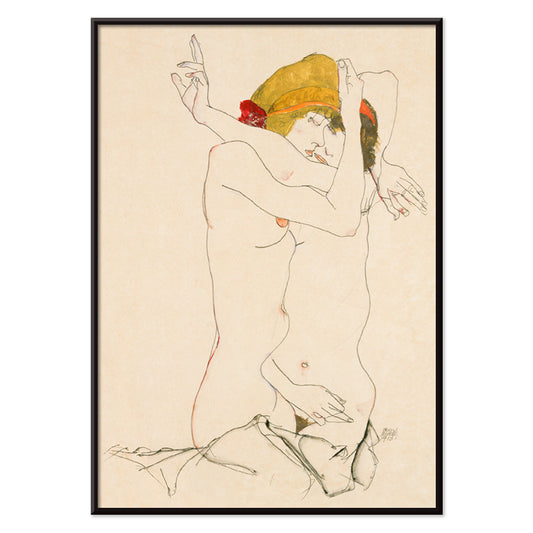
Dos mujeres abrazadas Póster
Egon Schiele · 1913 · Lámina íntima figurativa de dos mujeres entrelazadas en tonos beige y rojo
Póster desde €9 · Enmarcado desde €16
Precio habitual A partir de €6,00Precio habitual -
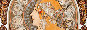
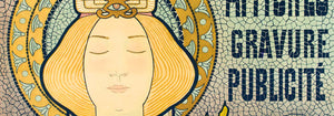
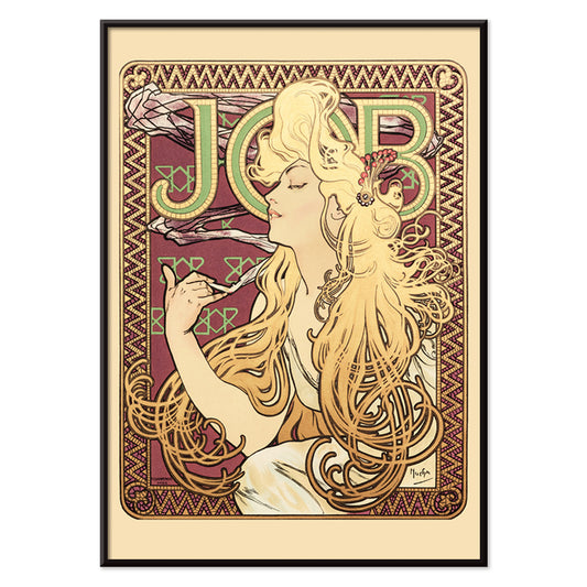
Job Póster
Alphonse Mucha · 1896 · Icónico póster Art Nouveau con perfil sensual y melena ornamental en cascada
Póster desde €9 · Enmarcado desde €16
Precio habitual A partir de €6,00Precio habitual -
Mujer aplicándose polvo Póster
Goyō Hashiguchi · 1918 · Elegante lámina artística bijin-ga de mujer aplicándose polvo en luz matutina serena
Póster desde €9 · Enmarcado desde €16
Precio habitual A partir de €6,00Precio habitual -
Yokugo no onna Póster
Goyō Hashiguchi · 1915 · Sobria lámina artística de mujer bañándose con piel pálida, cabello oscuro y acentos bermellón
Póster desde €9 · Enmarcado desde €16
Precio habitual A partir de €6,00Precio habitual -
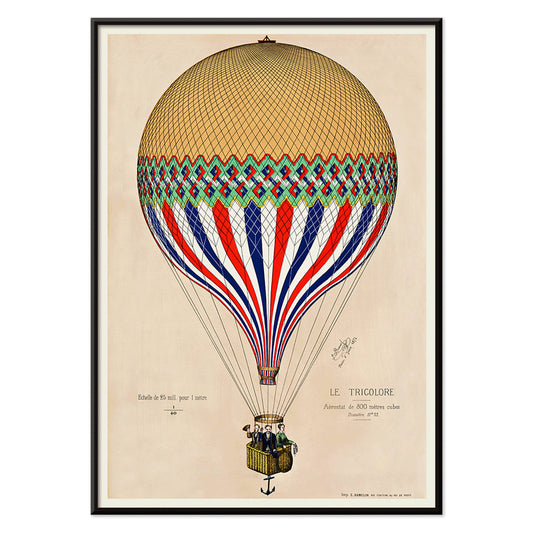
Globo tricolor Póster
Artista desconocido · 1874 · Póster de globo aerostático tricolor sobre París con paleta francesa
Póster desde €9 · Enmarcado desde €16
Precio habitual A partir de €6,00Precio habitual -
Adán y Eva Póster
Lucas Cranach · 1535 · Elegante lámina renacentista de Adán y Eva junto al árbol tentador
Póster desde €9 · Enmarcado desde €16
Precio habitual A partir de €6,00Precio habitual -
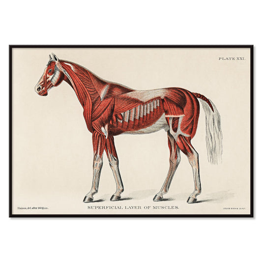
Músculos superficiales del caballo Póster
Artista desconocido · 1904 · Lámina científica detallada de anatomía equina que muestra músculos superficiales en rojo con etiquetas numeradas nítidas
Póster desde €9 · Enmarcado desde €16
Precio habitual A partir de €6,00Precio habitual -
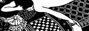
Au Lido Póster
George Barbier · 1920 · Elegante póster Art Deco con figuras alargadas, parasoles y serena escena marinera
Póster desde €9 · Enmarcado desde €16
Precio habitual A partir de €6,00Precio habitual -
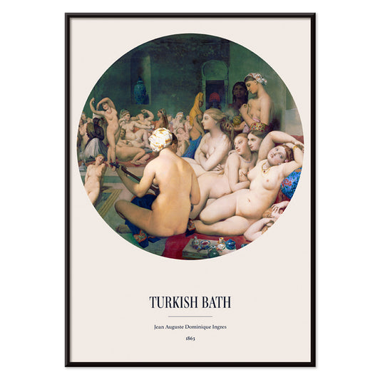
The Turkish Bath Póster
Jean Auguste Dominique Ingres · 1863 · Lámina artística orientalista y sensual con bañistas entrelazadas en un tondo luminoso
Póster desde €9 · Enmarcado desde €16
Precio habitual A partir de €6,00Precio habitual -
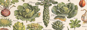
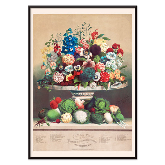
Flores y Verduras Póster
Anton Carl Rahn · 1800 · Refinada lámina de naturaleza muerta que combina flores de jardín con verduras recién recolectadas en beige
Póster desde €9 · Enmarcado desde €16
Precio habitual A partir de €6,00Precio habitual -
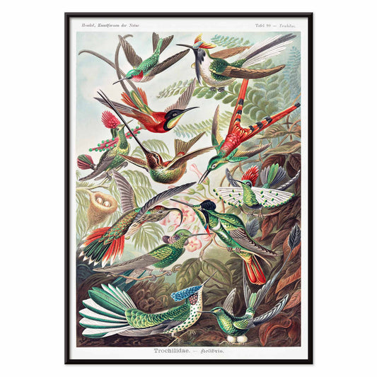
Trochilidae Póster
Ernst Haeckel · 1904 · Detallada lámina científica de colibríes que une precisión histórica y elegancia ornamental
Póster desde €9 · Enmarcado desde €16
Precio habitual A partir de €6,00Precio habitual -
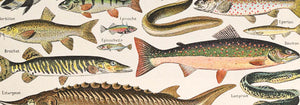
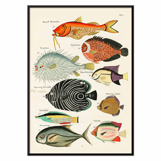
Ilustraciones surrealistas de peces Póster
Louis Renard · 1754 · Lámina de peces exóticos y vivos con coloreado a mano y aire teatral naturalista
Póster desde €9 · Enmarcado desde €16
Precio habitual A partir de €6,00Precio habitual -
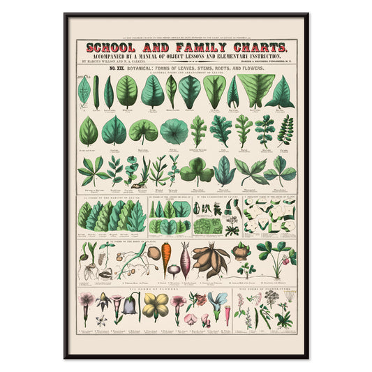
Formas de las hojas Póster
Marcius Willson · 1890 · Lámina educativa de anatomía foliar con formas etiquetadas y suaves tonos verdes
Póster desde €9 · Enmarcado desde €16
Precio habitual A partir de €6,00Precio habitual -
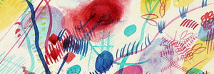
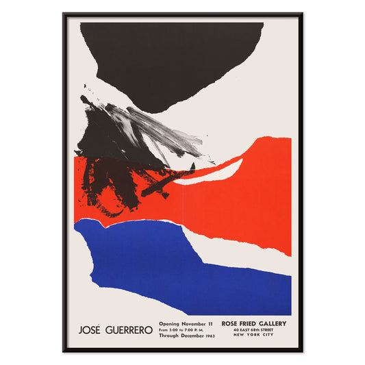
Rose Fried Gallery Póster
José Guerrero · 1963 · Enérgico póster abstracto equilibrando pinceladas negras, rojas y azules sobre blanco
Póster desde €9 · Enmarcado desde €16
Precio habitual A partir de €6,00Precio habitual -
Despierta y lee Póster
Artista desconocido · 1961 · Póster modernista sobre la lectura con tipografía fuerte y contraste rojo y azul
Póster desde €9 · Enmarcado desde €16
Precio habitual A partir de €6,00Precio habitual -
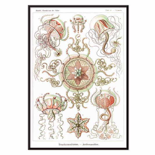
Trachomedusae Póster
Ernst Haeckel · 1904 · Detallada lámina científica de medusas con tentáculos fluidos y translucidez marina natural
Póster desde €9 · Enmarcado desde €16
Precio habitual A partir de €6,00Precio habitual -
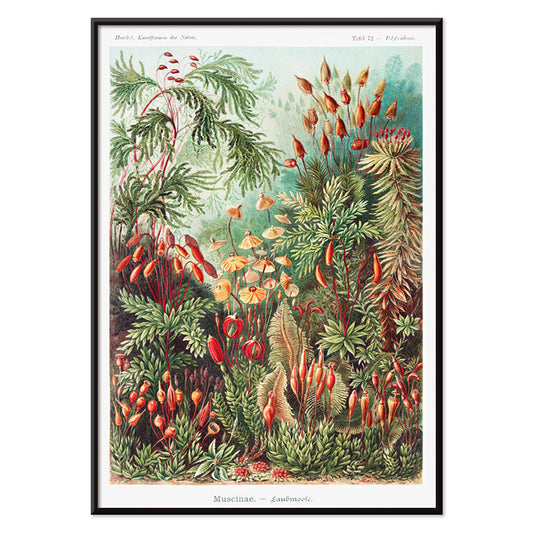
Muscinae–Laubmoose Póster
Ernst Haeckel · 1904 · Lámina científica detallada de musgos foliosos presentada como un estudio de gabinete natural
Póster desde €9 · Enmarcado desde €16
Precio habitual A partir de €6,00Precio habitual -
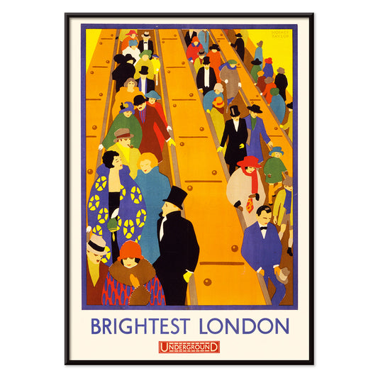
Londres más luminosa 2 Póster
Horace Taylor · 1924 · Dinámico póster del metro de Londres con multitudes en escaleras mecánicas y bloques de color Art Déco
Póster desde €9 · Enmarcado desde €16
Precio habitual A partir de €6,00Precio habitual -
Jantzen 2 Póster
Joseph Binder · 1952 · Dinámico póster de esquí con pareja estilizada y bloques azules, blancos y rojos
Póster desde €9 · Enmarcado desde €16
Precio habitual A partir de €6,00Precio habitual -
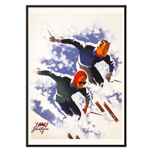
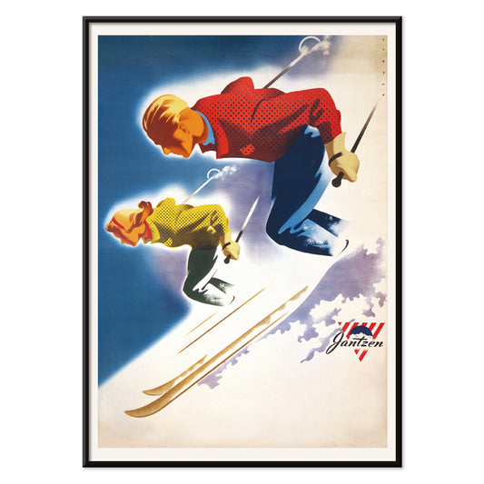
Jantzen Póster
Joseph Binder · 1952 · Enérgico póster de esquí con pareja estilizada recortando audaces formas alpinas
Póster desde €9 · Enmarcado desde €16
Precio habitual A partir de €6,00Precio habitual -
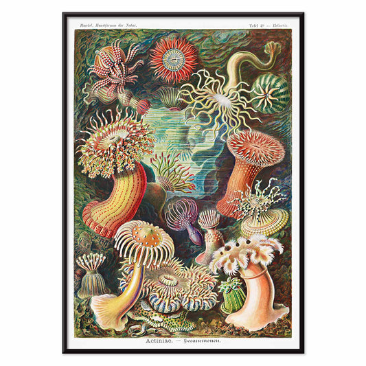
Actiniae Póster
Ernst Haeckel · 1904 · Lámina científica detallada de anémonas marinas con tentáculos radiantes tipo flores joya
Póster desde €9 · Enmarcado desde €16
Precio habitual A partir de €6,00Precio habitual -
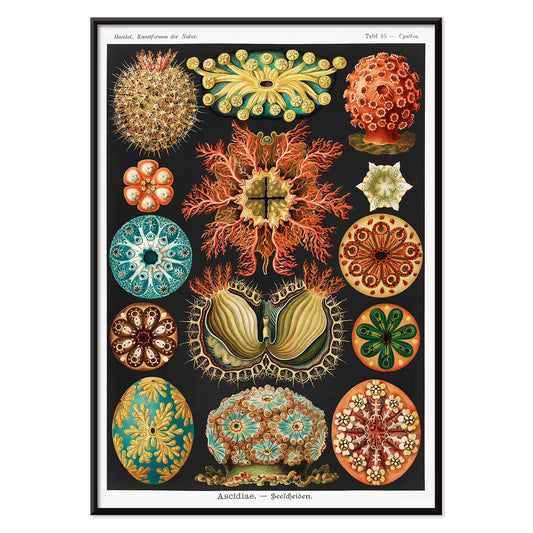
Ascidiae Póster
Ernst Haeckel · 1904 · Lámina científica detallada de ascidias con disposición simétrica tipo historia natural
Póster desde €9 · Enmarcado desde €16
Precio habitual A partir de €6,00Precio habitual -
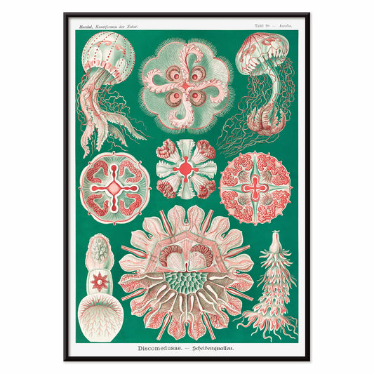
Discomedusae Póster
Ernst Haeckel · 1904 · Detallada lámina científica de medusas con campanas flotantes y tentáculos en encaje
Póster desde €9 · Enmarcado desde €16
Precio habitual A partir de €6,00Precio habitual -
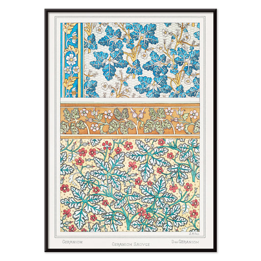
Geranio silvestre Póster
Maurice Pillard Verneuil · 1896 · Póster estilizado de geranio silvestre con curvas Art Nouveau y follaje ornamentado
Póster desde €9 · Enmarcado desde €16
Precio habitual A partir de €6,00Precio habitual -
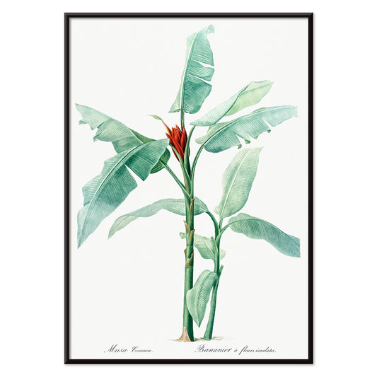
Banana escarlata Póster
Pierre-Joseph Redouté · 1805 · Elegante lámina botánica de banana escarlata con hojas verdes nítidas y flor roja intensa
Póster desde €9 · Enmarcado desde €16
Precio habitual A partir de €6,00Precio habitual -
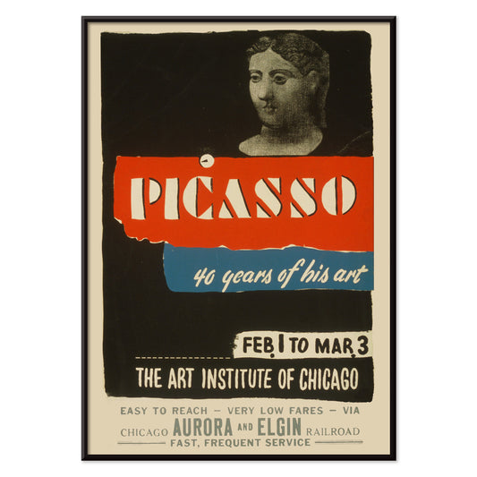
Picasso - 40 años de su arte Póster
Art Institute of Chicago · 1970 · Impactante póster de exposición con tipografía rotunda y figura abstracta moderna en rojo y azul
Póster desde €9 · Enmarcado desde €16
Precio habitual A partir de €6,00Precio habitual -
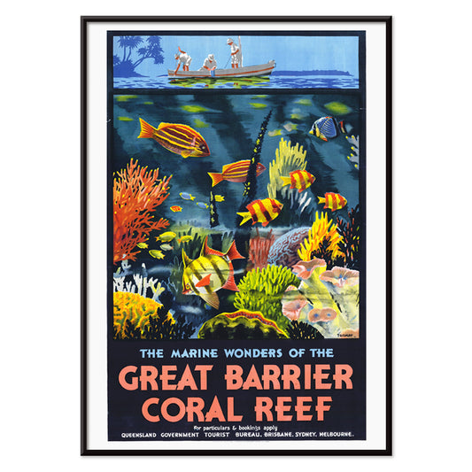
Las maravillas marinas Póster
Percival Albert Trompf · 1933 · Póster Art Deco de la Gran Barrera de Coral con peces vivos y corales en azul profundo
Póster desde €9 · Enmarcado desde €16
Precio habitual A partir de €6,00Precio habitual -
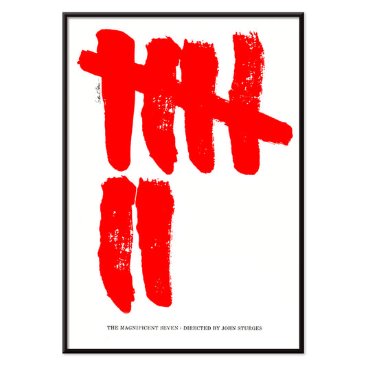
The Magnificent Seven Póster
Saul Bass · 1960 · Póster de cine minimalista con siete marcas rojas tipo pincel sobre fondo blanco
Póster desde €9 · Enmarcado desde €16
Precio habitual A partir de €6,00Precio habitual -
Attack of the 50ft Women Póster
Reynold Brown · 1958 · Enérgico póster de ciencia ficción con mujer gigantesca dominando coches y calles
Póster desde €9 · Enmarcado desde €16
Precio habitual A partir de €6,00Precio habitual -
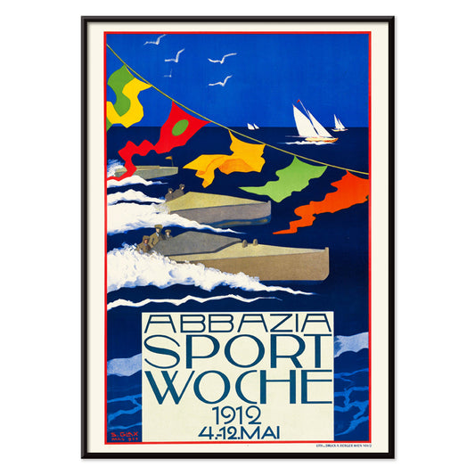
Abbazia Sport Woche Póster
Stefanie Glax · 1912 · Dinámico póster de regata con velas audaces sobre intensos azules y luz costera
Póster desde €9 · Enmarcado desde €16
Precio habitual A partir de €6,00Precio habitual -
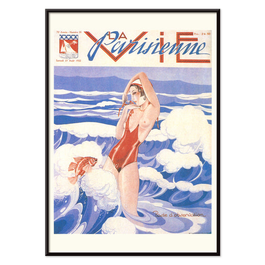
La Vie Parisienne Póster
Umberto Brunelleschi · 1932 · Póster Art Deco con mujer segura en bañador rojo sobre fondo azul y blanco
Póster desde €9 · Enmarcado desde €16
Precio habitual A partir de €6,00Precio habitual


36/761 items
- Mujer aplicándose colorete Póster
- Mujer desnuda de pie Póster
- Plumas Póster
- Gatos Póster
- Dos mujeres abrazadas Póster
- Job Póster
- Mujer aplicándose polvo Póster
- Yokugo no onna Póster
- Globo tricolor Póster
- Au Lido Póster
- Trochilidae Póster
- Ilustraciones surrealistas de peces Póster
- Formas de las hojas Póster
- Rose Fried Gallery Póster
- Despierta y lee Póster
- Muscinae–Laubmoose Póster
- Actiniae Póster
- Geranio silvestre Póster
- Las maravillas marinas Póster
- The Magnificent Seven Póster
- Attack of the 50ft Women Póster
- Abbazia Sport Woche Póster
- La Vie Parisienne Póster
Rojo, el acento más intencionado
En la colección Rojo, el color actúa menos como tema que como señal: un sello amapola, un titular lacado, un rubor cálido sobre papel. Estos pósters transitan entre la ilustración, el modernismo, los gráficos de viaje y las láminas diagramáticas, y aun así cada uno depende del rojo para dirigir la atención. Bermellón sobre crema, ladrillo contra grafito o una única forma escarlata en un espacio sereno puede cambiar la lectura de una habitación. Como arte mural, el rojo funciona como un condimento en la decoración: un pequeño acento dinamiza una galería de pared, mientras que un campo mayor establece un punto focal y una sensación de dirección en la composición.
Oficio, pigmento y el arte de persuadir
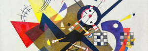
El rojo ha llevado peso técnico y cultural a lo largo de la historia gráfica. Tinturas y pigmentos antiguos como la cochinilla y la rubia marcaron textiles y artes decorativas, mientras que la litografía situó la tipografía roja y los campos planos de color en el centro de la cultura visual pública. Strawberry Thief (1883) de William Morris emplea el rojo como nota estructural dentro del motivo repetido, manteniendo aves y frutos en tensión rítmica. En Hygieia (1907) de Gustav Klimt, la túnica se lee como emblema y aviso, con el carmesí actuando como borde alrededor de la figura. Heavy Red (1924) de Wassily Kandinsky presenta el rojo como masa, un plano que empuja las formas adyacentes hacia el movimiento y hace que la geometría adquiera presencia física.
Dónde mejor vive el rojo
Los acentos rojos encajan con más naturalidad junto a materiales honestos: nogal, terracota, latón, lino y piedra desgastada. En cocinas y rincones de comedor, los estudios frutales y la iconografía vegetal hacen eco de los tonos de la mesa y la cerámica, por eso las impresiones de Botánica son compañeras fáciles de una decoración dominada por el rojo. En pasillos y entradas, un elemento rojo y rotundo ayuda a guiar la mirada por un espacio angosto; la lógica gráfica de la Publicidad funciona bien con espejos, percheros y suelos más oscuros. Para dormitorios, conviene mantener el rojo en dosis pequeñas y cálidas, inclinándose hacia el ladrillo o el rosa viejo en lugar del escarlata primario, y equilibrarlo con ropa de cama pálida y una luz ámbar baja. Si la estancia se abre a zonas verdes, el rojo se convierte en un contrapunto claro; escenas más sosegadas de Paisajes ayudan a mantener la paleta anclada.
Combinaciones, enmarcado y creación de una galería
Para evitar que el rojo domine, trátalo como una voz dentro de una paleta medida. Un paspartú blanco da aire al rojo, mientras que un marco negro fino afila las zonas saturadas y hace eco de la disciplina de la imagen en Blanco y Negro. Para emparejamientos estructurados, coloca un póster liderado por el rojo junto a trabajos geométricos de Bauhaus, donde el rojo suele aparecer como bloque controlado más que como adorno. En un registro más teatral, Cachou Lajaunie (1920) de Leonetto Cappiello actúa como farola frente a maderas profundas y paredes apagadas. Al organizar una galería, repite el rojo dos veces, una como área mayor y otra como pequeño acento, para que la mirada tenga un recorrido claro entre las láminas.
Una reflexión final sobre el rojo
El rojo también es una pista útil para leer imágenes: en los gráficos de viaje señala calor, vida nocturna y apetito; en la composición modernista marca el punto donde la atención errante se fija. Por eso esta selección puede saltar del patrón a la figura simbolista o a la abstracción de bordes duros sin perder coherencia. Deja espacio alrededor del campo rojo más ruidoso y permite que las láminas vecinas lleven tonos más tranquilos como arena, tinta y verde vidrio marino. Usado así, el rojo se vuelve ritmo en lugar de ruido, y la decoración empieza a sentirse intencional sin volverse rígida.