


You may also like
-
Volcanes y Terremotos Póster
James Reynolds · 1849 · Lámina vintage detallada que cartografía cinturones volcánicos y zonas sísmicas
Póster desde €9 · Enmarcado desde €16
Precio habitual A partir de €6,00Precio habitual -
Mapa geológico del mundo Póster
James Reynolds · 1850 · Detallada lámina vintage de geología mundial con estratos codificados por color y etiquetas victorianas
Póster desde €9 · Enmarcado desde €16
Precio habitual A partir de €6,00Precio habitual -
Ríos y Lagos Póster
James Reynolds · 1851 · Comparación panorámica de ríos y lagos en póster que une cartografía e infografía inicial
Póster desde €9 · Enmarcado desde €16
Precio habitual A partir de €6,00Precio habitual -
Fenómenos naturales Póster
James Reynolds · 1852 · Lámina científica detallada que muestra volcanes, rayos, nubes y corrientes oceánicas
Póster desde €9 · Enmarcado desde €16
Precio habitual A partir de €6,00Precio habitual


-

"Very nice Posters. The quality is amazing and we received it very quickly !"
-

"A shop to visit absolutely. Huge selection of posters. We spent more than an hour there !"
-

"Perfect to find gift. Price are very good. An they can frame and pack it on site"


Sobre el artista
James Reynolds fue un editor londinense activo a mediados del siglo XIX, en una época en que las láminas educativas jugaron un papel esencial para acercar conocimientos científicos y geográficos a la vida cotidiana. Su casa editorial se ganó la reputación de producir materiales de referencia accesibles y visualmente atractivos, reflejo de la fascinación victoriana por el descubrimiento y el aprendizaje.
Este pliego de 1851 es prueba del compromiso de la época con la educación pública a través de la impresión, concebido para hacer que la información compleja resultara comprensible para un público amplio. Las obras de Reynolds se encontraban con frecuencia en escuelas y hogares, sirviendo de puente entre el saber académico y la curiosidad popular.
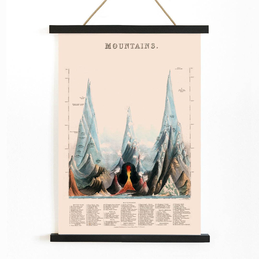
La obra
Esta vista comparativa de montañas fue creada para comunicar visualmente las alturas relativas de picos famosos de todo el mundo. En lugar de presentar los datos como números abstractos, la lámina dispone los perfiles montañosos uno junto a otro, transformando los hechos geográficos en una narrativa visual convincente. Estas piezas surgieron en una época de rápida exploración global y avance científico, cuando el público demandaba entender mejor el planeta.
Como parte de la tradición de láminas científicas y educativas, este gráfico ejemplifica cómo los editores victorianos empleaban el diseño para estimular la curiosidad y hacer el aprendizaje visualmente atractivo. También conecta con coleccionistas interesados en arte mural inspirado en mapas y en la historia de la exploración.
Estilo y características
La lámina adopta un formato panorámico de tipo atlas, con siluetas montañosas meticulosamente organizadas para resaltar las diferencias de elevación. Cada pico aparece claramente rotulado, y la composición ordenada prioriza la claridad y la comparación por encima de la ornamentación artística. El fino trazo y el espaciamiento cuidadoso reflejan la precisión de las técnicas de grabado del siglo XIX.
Un fondo cálido beige contrasta con los tonos fríos azules de las montañas, mientras que el rojo y el negro se usan para nombres y escalas de medida. El resultado transmite una sensación sosegada y erudita, con un sutil aire de aventura, lo que la convierte en una elección refinada para quienes aprecian láminas vintage que combinan atractivo decorativo y sustancia intelectual.
En la decoración interior
Esta lámina montañosa vintage encaja bien en despachos, bibliotecas, pasillos o salones donde su carácter educativo pueda apreciarse. También funciona en la habitación de un adolescente o en espacios de inspiración escolar, ofreciendo una visión sofisticada de la temática geográfica.
Combínala con madera natural, lino y marcos negros o neutros para un aspecto clásico, o mézclala con láminas de paisaje y arte clásico para un muro curado. Su paleta neutra se integra con facilidad en interiores modernos, escandinavos o tradicionales, aportando un toque de erudición y encanto vintage.