


-

'Pósters preciosos. La calidad es increíble y llegaron rapidísimo.'
-

'Una tienda a la que hay que ir sí o sí. Tienen una selección enorme de pósters. ¡Nos pasamos allí más de una hora!'
-

'Perfecto si buscas un regalo. Los precios están muy bien. Y te lo pueden enmarcar y envolver allí mismo'


Sobre el artista
Kazumasa Ogawa fue una figura pionera del Japón de la era Meiji, conocido por fusionar técnicas fotográficas occidentales con tradiciones artísticas japonesas. Su dominio de la fotografía y del colotipo contribuyó a dar a conocer la cultura visual japonesa a una audiencia internacional a finales del siglo XIX
El legado de Ogawa continúa apreciado entre coleccionistas de arte japonés y en el ámbito de las láminas de fotografía vintage, donde su exigencia técnica y su estética refinada siguen inspirando el interés por las primeras imprentas japonesas
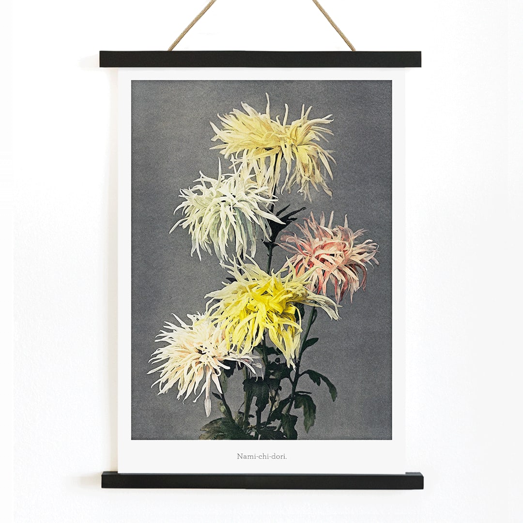
La obra
Nami–chi–dori, olas y chorlitos, es un motivo tradicional en el arte japonés que simboliza la perseverancia y el viaje a través de las mareas cambiantes de la vida. Este tema tuvo una resonancia especial durante la época Meiji, cuando los artistas buscaban preservar imágenes tradicionales adaptándolas a nuevas técnicas de impresión y a públicos contemporáneos
Creada en 1896, la obra refleja el interés de la época por trasladar el espíritu del diseño decorativo japonés a formatos accesibles tanto para espectadores locales como internacionales. Es un testimonio del diálogo entre patrimonio e innovación en la cultura visual Meiji
Estilo y características
La composición presenta patrones rítmicos y estilizados de olas junto a pequeñas siluetas de aves, todo ello sobre amplios espacios negativos que transmiten movimiento y tranquilidad. Las líneas limpias y las formas equilibradas recuerdan al diseño de una plancha, mientras que las sutiles gradaciones de tono ponen de manifiesto el refinado oficio de la impresión Meiji
La paleta es contenida, dominada por grises y blancos suaves, complementados por acentos naturales que evocan una atmósfera costera. Esta elegancia sobria permite combinar la obra con otras láminas japonesas y orientales o convertirla en un punto focal sereno dentro de una composición de pared
En la decoración interior
Esta lámina vintage encaja en interiores que buscan calma y simplicidad, como estilos Japandi, minimalista o clásico moderno. Funciona muy bien en salones, dormitorios o pasillos, donde su presencia serena contribuye a una sensación de orden y relax
Para un estilo armónico, combina sus tonos neutros fríos con materiales pétreos, blancos rotos y mobiliario en gris suave, incorporando toques discretos de verde o amarillo apagado en los textiles. Si se desea reforzar una temática costera, emparejarla con piezas de la colección mar y océano (sea and ocean collection) crea un conjunto coherente y tranquilo