


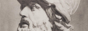


- Destruye a este bruto enloquecido Póster
- Shaw o la ironía Póster
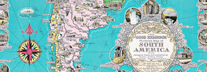
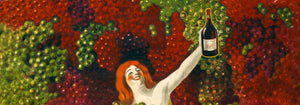
- El buen vecino de Sudamérica Póster
- Italia y Ciudad del Vaticano Póster
- Cebollas Póster
- Rábanos Póster
- Zanahorias Póster
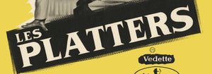
- Les Lalanne Póster
- Punch Boutique Póster
- Pareja bailando en la nieve Póster
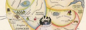
- Punto de vista sobre judaísmo y paganismo Póster
- Jet Clipper a Hawái Póster
- Campari Soda Póster
- Bec-Kina Póster
- Kohler Chocolat Póster
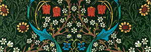
- Strawberry Thief Póster
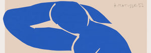
- Figuras danzantes de Matisse Póster
- Exposición Tom Krojer Póster
- Escena callejera de Berlín Póster
- Exposición de Ernst Kirchner Póster
- Tour Eiffel 2 Póster
- Mujer sentada de espaldas Póster
- Cabello rojo y sombrero azul Póster
- Parque cerca de Lu Póster
- El Comienzo Póster
- Formas abstractas Parler Seul 2 Póster
- La postura actual de los Mahatmas Póster
- Twilight’s Ring Póster
- Parler Seul Póster
- Fauno y Ninfa Póster
- The Dream Póster
- Le Concert Póster
- Artista femenina Póster
-
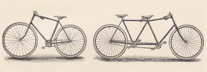
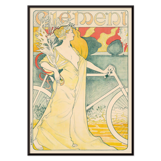
Bicicleta Clément Póster
Arthur Foache · 1900 · Póster Art Nouveau de bicicleta con ciclista elegante y vestido vaporoso en tonos vivos
Póster desde €9 · Enmarcado desde €16
Precio habitual A partir de €6,00Precio habitual -
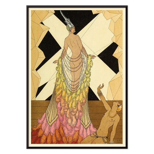
Falbalas et fanfreluches - Orgueil Póster
George Barbier · 1925 · Póster Art Deco con mujer en pose elegante y tonos amarillos y negros
Póster desde €9 · Enmarcado desde €16
Precio habitual A partir de €6,00Precio habitual -
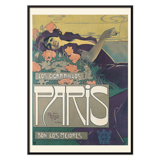
Cigarrillos París Póster
Aleardo Villa · 1901 · Elegante póster de la Belle Époque con mujer recostada entre flores rosas y moradas
Póster desde €9 · Enmarcado desde €16
Precio habitual A partir de €6,00Precio habitual -
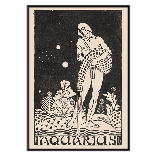
Acuario Póster
Henri van der Stok · 1913 · Póster de Acuario estilizado con el aguador en negro gráfico sobre beige
Póster desde €9 · Enmarcado desde €16
Precio habitual A partir de €6,00Precio habitual -
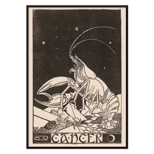
Cáncer Póster
Henri van der Stok · 1913 · Ensoñador póster de Cáncer con cangrejo entre estrellas en negro y beige
Póster desde €9 · Enmarcado desde €16
Precio habitual A partir de €6,00Precio habitual -
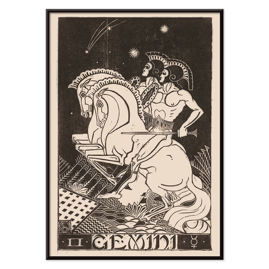
Géminis Póster
Henri van der Stok · 1913 · Póster Celestial Géminis con jinetes gemelos a caballo en finas líneas negras
Póster desde €9 · Enmarcado desde €16
Precio habitual A partir de €6,00Precio habitual -
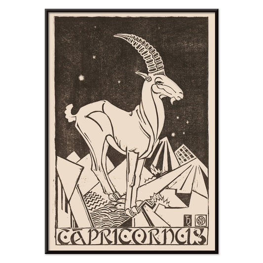
Capricornus Póster
Henri van der Stok · 1913 · Póster de Capricornus simbólico con formas negras contundentes y ambiente celeste sereno
Póster desde €9 · Enmarcado desde €16
Precio habitual A partir de €6,00Precio habitual -
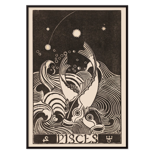
Piscis Póster
Henri van der Stok · 1913 · Póster gráfico de Piscis con dos peces circulando entre olas
Póster desde €9 · Enmarcado desde €16
Precio habitual A partir de €6,00Precio habitual -
Sagitario Póster
Henri van der Stok · 1900 · Impactante póster Sagitario con centauro arquero, perro fiel y geometría estelar
Póster desde €9 · Enmarcado desde €16
Precio habitual A partir de €6,00Precio habitual -
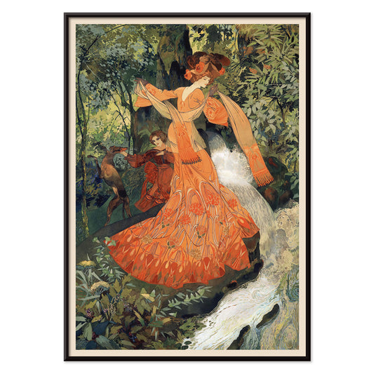
Elegante junto a un manantial Póster
Georges de Feure · 1898 · Póster Art Nouveau de una mujer elegante en vestido naranja junto a un manantial
Póster desde €9 · Enmarcado desde €16
Precio habitual A partir de €6,00Precio habitual -
Falbalas et fanfreluches: La paresse Póster
George Barbier · 1925 · Exuberante lámina Art Deco con mujer reclinada en vibrantes colores pochoir
Póster desde €9 · Enmarcado desde €16
Precio habitual A partir de €6,00Precio habitual -
La Vasque Póster
George Barbier · 1914 · Elegante póster Art Déco de escena de baño en azules fríos y toques naranja
Póster desde €9 · Enmarcado desde €16
Precio habitual A partir de €6,00Precio habitual -
Un Brin de Muguet Póster
Léo Fontan · 1905 · Póster Art Nouveau de muguete con figura elegante y tipografía nítida
Póster desde €9 · Enmarcado desde €16
Precio habitual A partir de €6,00Precio habitual -
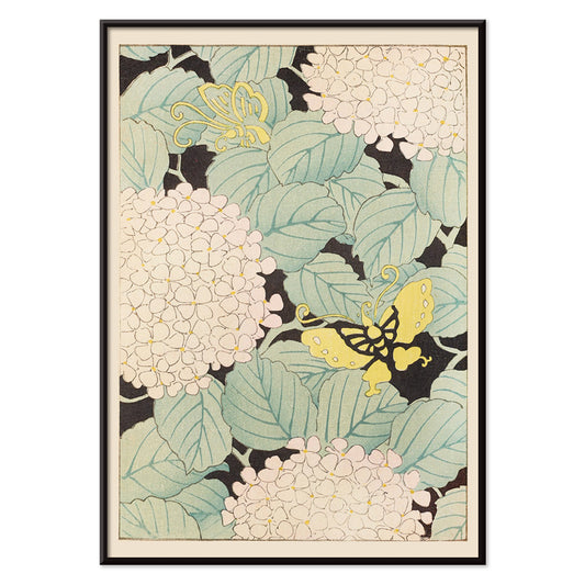
Bijutsukai Pl.169 Póster
Korin Furuya · 1901 · Suave y elegante póster japonés con hortensias blancas y mariposas amarillas
Póster desde €9 · Enmarcado desde €16
Precio habitual A partir de €6,00Precio habitual -
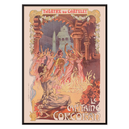
Le Capitaine Corcoran Póster
Vincent Lorant-Heilbronn · 1902 · Póster teatral festivo con bailarinas alrededor de una hoguera entre motivos modernistas
Póster desde €9 · Enmarcado desde €16
Precio habitual A partir de €6,00Precio habitual -
Bijutsukai Pl.218 Póster
Korin Furuya · 1901 · Póster de crisantemos estilizados con bloques geométricos suaves y espacio negativo
Póster desde €9 · Enmarcado desde €16
Precio habitual A partir de €6,00Precio habitual -
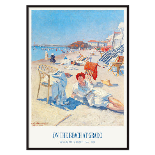
En la playa de Grado Póster
Eduard Otto Braunthal · 1910 · Póster de la playa de Grado con bañistas, azules y rojos cálidos
Póster desde €9 · Enmarcado desde €16
Precio habitual A partir de €6,00Precio habitual -
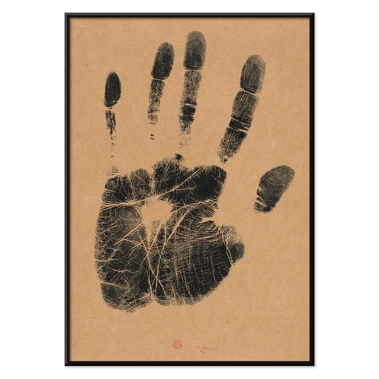
Mano izquierda del artista Póster
Henri-Charles Guérard · 1890 · Póster minimalista con huella de mano negra sobre fondo beige sereno
Póster desde €9 · Enmarcado desde €16
Precio habitual A partir de €6,00Precio habitual -
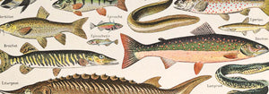
Guacamayos Póster
Artista desconocido · 1893 · Vívida lámina de guacamayos entre frondosa selva con detalle naturalista
Póster desde €9 · Enmarcado desde €16
Precio habitual A partir de €6,00Precio habitual -
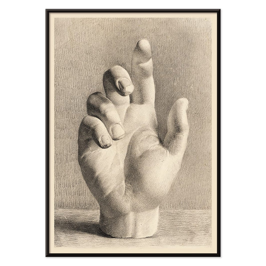
Mano de yeso Póster
Dankvart Dreyer · 1829 · Estudio académico de mano en lámina artística con suave sombreado sobre papel beige cálido
Póster desde €9 · Enmarcado desde €16
Precio habitual A partir de €6,00Precio habitual -
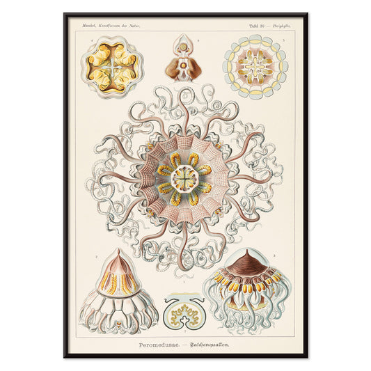
Peromedusae Póster
Ernst Haeckel · 1904 · Detallada lámina científica de medusas con campanas flotantes y tentáculos en encaje
Póster desde €9 · Enmarcado desde €16
Precio habitual A partir de €6,00Precio habitual -
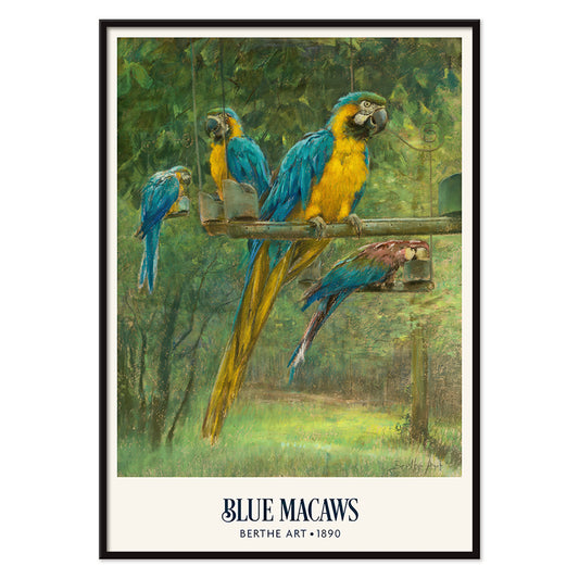
Guacamayos azules Póster
Berthe Art · 1890 · Vívido póster de guacamayos con plumaje azul y amarillo entre denso follaje tropical
Póster desde €9 · Enmarcado desde €16
Precio habitual A partir de €6,00Precio habitual -
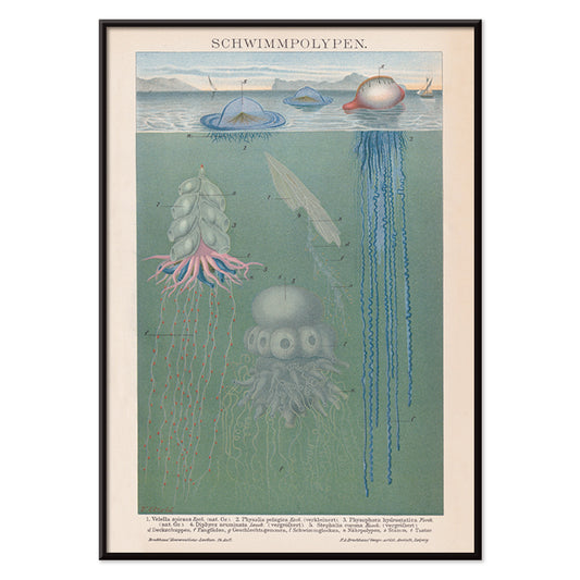
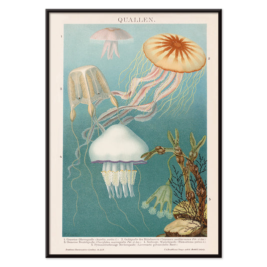
Pólipos nadadores Póster
Institute Of Liepzig · 2018 · Lámina científica marina detallada de pólipos y medusas en tonos fríos del mar
Póster desde €9 · Enmarcado desde €16
Precio habitual A partir de €6,00Precio habitual -
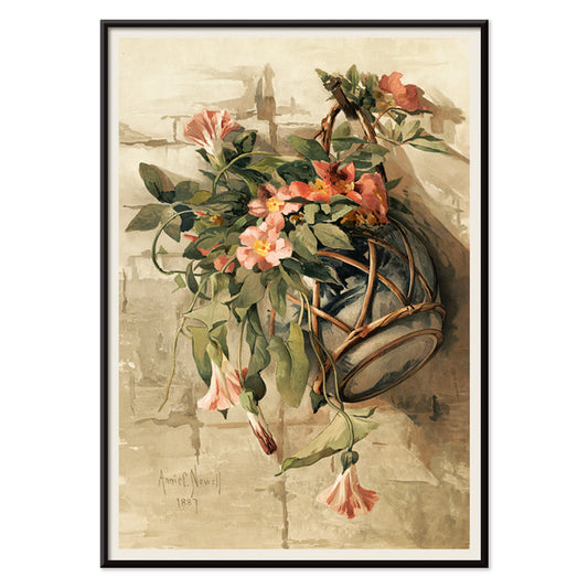
Flores rosas en jarrón colgante Póster
Annie Nowell · 1880 · Delicada lámina artística de flores rosadas en jarrón colgante sobre beige cálido
Póster desde €9 · Enmarcado desde €16
Precio habitual A partir de €6,00Precio habitual -
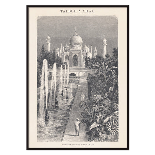
Taj Mahal Póster
The Institute of Liepzig · 2010 · Elegante póster del Taj Mahal con cúpulas simétricas y tonos grises y beige
Póster desde €9 · Enmarcado desde €16
Precio habitual A partir de €6,00Precio habitual -
Medusa Póster
The Institute of Liepzig · 2017 · Póster de medusa luminoso sobre azul profundo con finos tentáculos descendentes
Póster desde €9 · Enmarcado desde €16
Precio habitual A partir de €6,00Precio habitual -
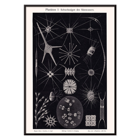
Plankton II Póster
The Institute of Liepzig · 2022 · Intrincada lámina científica de plancton de agua dulce con trazo nítido y poderoso contraste monocromo
Póster desde €9 · Enmarcado desde €16
Precio habitual A partir de €6,00Precio habitual -
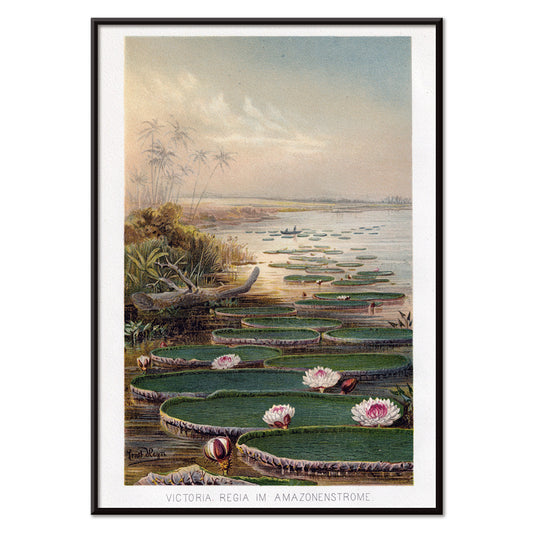
Nenúfar en la selva amazónica Póster
Institute of Liepzieg · 2017 · Póster sereno de nenúfares amazónicos con vegetación exuberante y flores rosa suaves
Póster desde €9 · Enmarcado desde €16
Precio habitual A partir de €6,00Precio habitual -
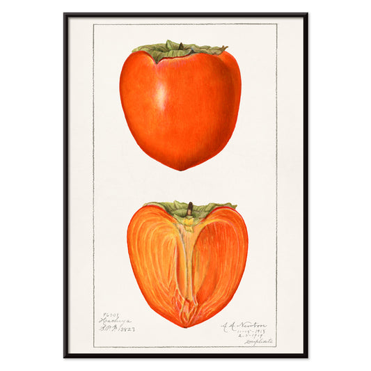
Caquis Póster
Amanda Almira Newton · 1923 · Delicada lámina botánica de caquis maduros en rama con hojas sobre fondo blanco limpio
Póster desde €9 · Enmarcado desde €16
Precio habitual A partir de €6,00Precio habitual -
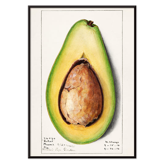
Aguacate (Persea) Póster
Amanda Almira Newton · 1916 · Refinada lámina botánica de aguacate con fruto verde y mitad que muestra la semilla
Póster desde €9 · Enmarcado desde €16
Precio habitual A partir de €6,00Precio habitual -
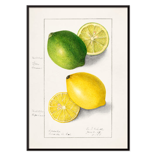
Limones (Citrus limon) Póster
Ellen Isham Schutt · 1908 · Luminosa lámina botánica de limón con formas nítidas y follaje verde fresco
Póster desde €9 · Enmarcado desde €16
Precio habitual A partir de €6,00Precio habitual -
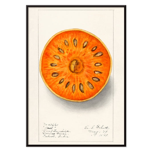
Bael (Aegle marmelos) Póster
Ellen Isham Schutt · 1909 · Luminosa lámina de bael que combina precisión científica con cálidos tonos tropicales
Póster desde €9 · Enmarcado desde €16
Precio habitual A partir de €6,00Precio habitual -
Aguacate (Persea) Póster
Amanda Almira Newton · 1916 · Detallada lámina botánica de aguacate con mitades maduras y hojas verdes brillantes
Póster desde €9 · Enmarcado desde €16
Precio habitual A partir de €6,00Precio habitual -
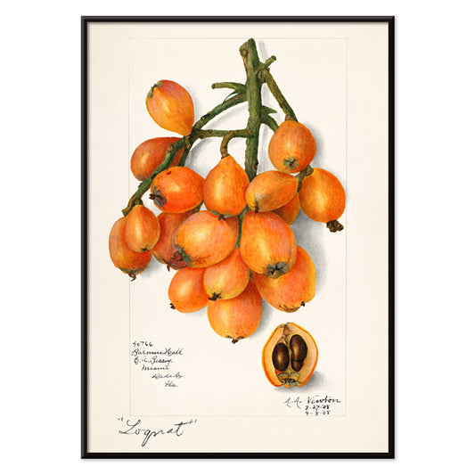
Nísperos (Eriobotrya japonica) Póster
Amanda Almira Newton · 1908 · Luminosa lámina botánica de nísperos con fruta naranja cálida y fondo blanco nítido
Póster desde €9 · Enmarcado desde €16
Precio habitual A partir de €6,00Precio habitual -
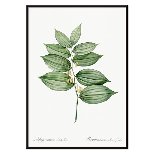
Sello King Solomon Póster
Pierre-Joseph Redouté · 1805 · Elegante lámina botánica Sello de King Solomon con hojas verdes arqueadas y flores blancas
Póster desde €9 · Enmarcado desde €16
Precio habitual A partir de €6,00Precio habitual -
Sello de Salomón verticilado Póster
Pierre-Joseph Redouté · 1805 · Elegante lámina botánica de sello de Salomón verticilado con tallo arqueado y hojas nítidas
Póster desde €9 · Enmarcado desde €16
Precio habitual A partir de €6,00Precio habitual


36/1512 items
- Bicicleta Clément Póster
- Cigarrillos París Póster
- Acuario Póster
- Cáncer Póster
- Géminis Póster
- Capricornus Póster
- Piscis Póster
- Sagitario Póster
- Elegante junto a un manantial Póster
- Falbalas et fanfreluches: La paresse Póster
- La Vasque Póster
- En la playa de Grado Póster
- Mano de yeso Póster
- Pólipos nadadores Póster
- Medusa Póster
- Plankton II Póster
- Caquis Póster
- Aguacate (Persea) Póster
- Limones (Citrus limon) Póster
- Bael (Aegle marmelos) Póster
- Aguacate (Persea) Póster
- Nísperos (Eriobotrya japonica) Póster
- Sello King Solomon Póster
- Sello de Salomón verticilado Póster
Por qué los pósters verticales transforman una habitación
Un póster vertical actúa como un elemento arquitectónico: guía la mirada hacia arriba, reduce el ruido visual y aporta una proporción más clara a espacios pequeños. Los formatos en retrato se usan desde siempre en programaciones de teatro, portadas de libros y anuncios callejeros, donde el rectángulo alto permite una lectura pausada de arriba abajo. Como arte mural, esa misma estructura estabiliza interiores recargados y compone los recorridos, haciendo que pasillos y zonas de paso se sientan más ordenados. Es un formato útil para recibidores, corredores y la franja estrecha entre ventana y estantería, donde un póster horizontal se vería interrumpido.
Herencia gráfica y lo que enseña a la vista
El formato vertical nació en el espacio público. Anuncios de viajes, programas de cine y litografías comerciales enseñaron a los diseñadores a controlar la jerarquía con precisión: titular, imagen, letra pequeña, todo equilibrado por márgenes. Los mejores pósters vintage trasladan esa disciplina al presente, ya sean tipográficos o pictóricos. Áreas de color plano y contornos nítidos permiten leer la composición desde lejos, mientras que la textura del papel y la densidad de la tinta recompensan la mirada cercana. Esa lógica conecta naturalmente con la claridad de Bauhaus, con las formas reducidas del diseño Minimalista y con la estructura tonal de las imágenes en Blanco y Negro.
Colocar arte en retrato, habitación por habitación
En salones, un póster alto funciona junto a una librería, un mueble o una lámpara de pie, donde hace eco de las verticales presentes en el mobiliario. En dormitorios, los pósters en retrato encajan en la franja entre armario y puerta o como acento descentrado respecto a la cama, en lugar de quedarse centrados encima. Cocinas y rincones de comedor admiten piezas gráficas vintage, especialmente composiciones inspiradas en etiquetas de Publicidad, mientras que estudios botánicos más serenos de Botánica suavizan superficies duras como azulejo y acero. Para el color, considera el póster como la nota de acento: extrae un tono de la tinta hacia cojines o cerámica y mantén pared y marco discretos para que el rectángulo se lea con claridad.
Curar parejas, enmarcado y el ritmo de una pared galería
Los pósters verticales son fáciles de vivir cuando se curan en pares: una lámina densa en imagen al lado de un campo más calmado para que la pared alterne detalle y respiro. Un tercer elemento puede ampliar la composición, por ejemplo un contrapunto horizontal de Paisajes, pero mantén la separación constante para que el conjunto se sienta deliberado. Marcos finos negros realzan diseños gráficos; roble o nogal aportan calidez a imágenes de archivo, y opciones coordinadas se encuentran en Marcos. Usa un paspartú estrecho para dar aire a impresiones oscuras, especialmente en formatos pequeños, y cuelga por una línea central compartida a la altura de los ojos dejando que los bordes superiores varíen sutilmente para preservar el ritmo vertical.
La lógica serena del rectángulo alto
Las colecciones guiadas por el formato son flexibles: la orientación en retrato puede albergar fotos arquitectónicas, estudios simbólicos, abstracción o tipografía vintage sin imponer un único estado de ánimo. Lo que une a estos pósters es cómo el corte alto recorta una escena, equilibrando gesto y espacio negativo. Cuando la decoración empieza a sentirse saturada, una lámina vertical pensada puede restaurar el orden más eficazmente que un conjunto desordenado. Tratada como una apertura tranquila en la pared, permite que la habitación respire y, al mismo tiempo, ofrece un punto focal claro.