


- Destruye a este bruto enloquecido Póster
- Shaw o la ironía Póster
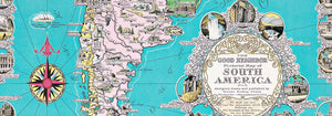
- El buen vecino de Sudamérica Póster
- Italia y Ciudad del Vaticano Póster
- Cebollas Póster
- Rábanos Póster
- Zanahorias Póster
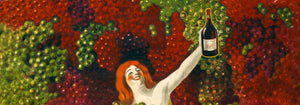
- Les Lalanne Póster
- Punch Boutique Póster
- Pareja bailando en la nieve Póster
- Punto de vista sobre judaísmo y paganismo Póster
- Jet Clipper a Hawái Póster
- Campari Soda Póster
- Bec-Kina Póster
- Kohler Chocolat Póster
- Strawberry Thief Póster
- Figuras danzantes de Matisse Póster
- Exposición Tom Krojer Póster
- Escena callejera de Berlín Póster
- Exposición de Ernst Kirchner Póster
- Tour Eiffel 2 Póster
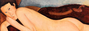
- Mujer sentada de espaldas Póster
- Cabello rojo y sombrero azul Póster
- Parque cerca de Lu Póster
- El Comienzo Póster
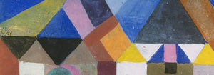
- Formas abstractas Parler Seul 2 Póster
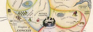
- La postura actual de los Mahatmas Póster
- Twilight’s Ring Póster
- Parler Seul Póster
- Fauno y Ninfa Póster
- The Dream Póster
- Le Concert Póster
- Pájaro cruzando una nube Póster
-
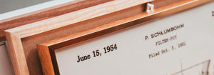
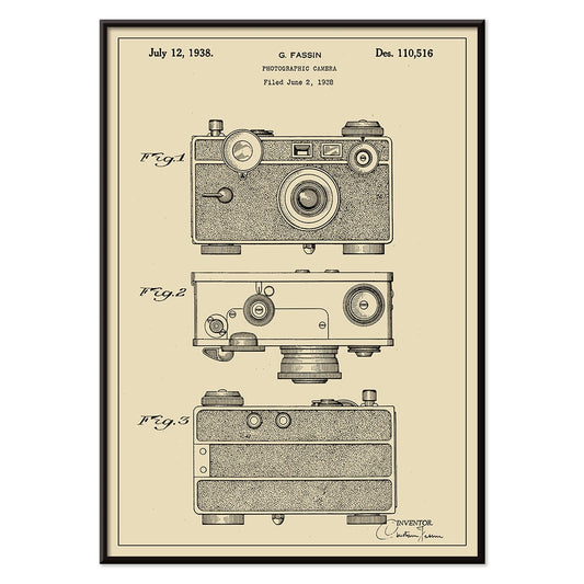
Patente de cámara fotográfica Póster
G. Fassin · 1938 · Lámina de patente de cámara precisa con diagramas numerados y trazos negros nítidos
Póster desde €9 · Enmarcado desde €16
Precio habitual A partir de €6,00Precio habitual -
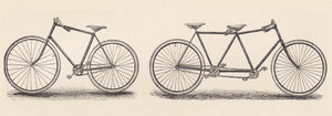
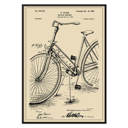
Patente de soporte para bicicleta Póster
B. Peisen · 1899 · Lámina vintage detallada del soporte de bicicleta con diagramas de patente nítidos y anotaciones
Póster desde €9 · Enmarcado desde €16
Precio habitual A partir de €6,00Precio habitual -
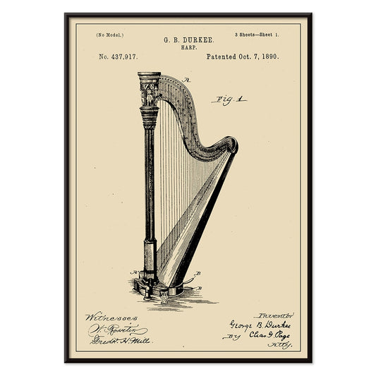
Patente de arpa Póster
G.B. Durkee · 1890 · Nítida lámina vintage de arpa con diagramas de patente precisos y tipografía archivística elegante
Póster desde €9 · Enmarcado desde €16
Precio habitual A partir de €6,00Precio habitual -
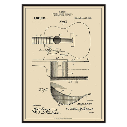
Patente de instrumento musical Póster
H. Ernst · 1916 · Intrincada lámina de patente de guitarra con diagramas precisos y referencias numeradas en beige cálido
Póster desde €9 · Enmarcado desde €16
Precio habitual A partir de €6,00Precio habitual -
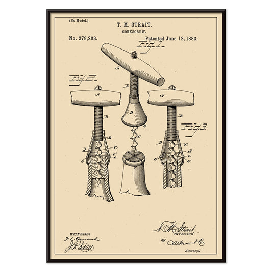
Patente de sacacorchos Póster
T.M. Strait · 1883 · Detallada lámina vintage de patente de sacacorchos con vistas técnicas y anotaciones
Póster desde €9 · Enmarcado desde €16
Precio habitual A partir de €6,00Precio habitual -
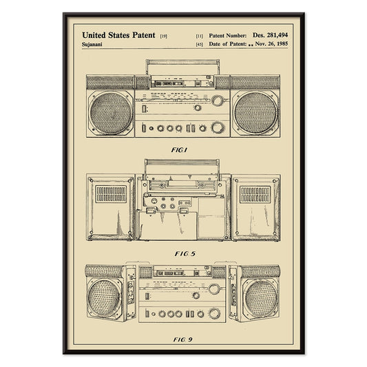
Patente de reproductor de casetes portátil Póster
Sujanani · 1985 · Póster de patente de reproductor de casetes con trazos negros precisos sobre fondo beige cálido
Póster desde €9 · Enmarcado desde €16
Precio habitual A partir de €6,00Precio habitual -
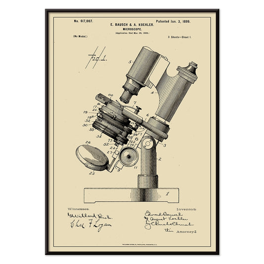
Patente de microscopio Póster
E. Bausch · 1899 · Precisa lámina de patente de microscopio con rotulación nítida sobre papel beige cálido
Póster desde €9 · Enmarcado desde €16
Precio habitual A partir de €6,00Precio habitual -
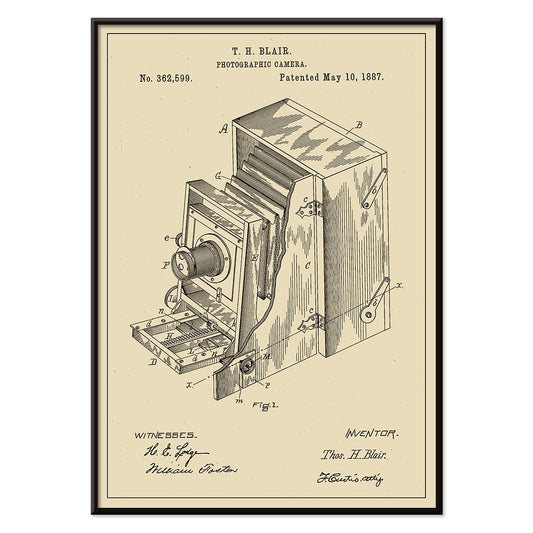
Patente de cámara fotográfica Póster
T.H Blair · 1887 · Lámina vintage de patente de cámara con diagramas nítidos y componentes numerados
Póster desde €9 · Enmarcado desde €16
Precio habitual A partir de €6,00Precio habitual -
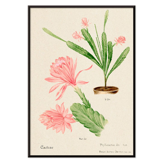
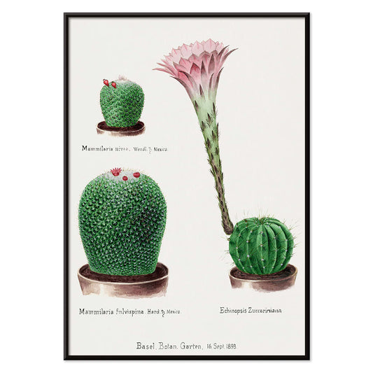
Cactus Emperatriz Alemana Póster
Artista desconocido · 1899 · Delicada lámina de cactus en flor rosa con detalle botánico nítido sobre fondo beige cálido
Póster desde €9 · Enmarcado desde €16
Precio habitual A partir de €6,00Precio habitual -
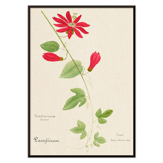
Granadilla roja Póster
Artista desconocido · 1899 · Impactante lámina botánica de pasionaria con flores escarlata, hojas verdes y fondo beige aireado
Póster desde €9 · Enmarcado desde €16
Precio habitual A partir de €6,00Precio habitual -
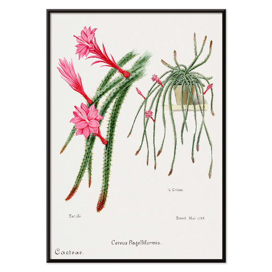
Cactus cola de rata Póster
Artista desconocido · 1899 · Elegante lámina de cactus cola de rata con tallos colgantes verdes y flores rojo rosa
Póster desde €9 · Enmarcado desde €16
Precio habitual A partir de €6,00Precio habitual -
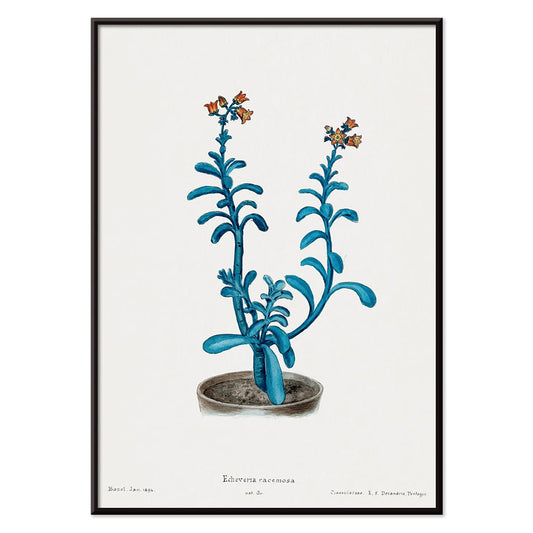
Echeveria racemosa Póster
Artista desconocido · 1899 · Lámina artística detallada de Echeveria racemosa con hojas azul verdosas y flores con punta roja
Póster desde €9 · Enmarcado desde €16
Precio habitual A partir de €6,00Precio habitual -
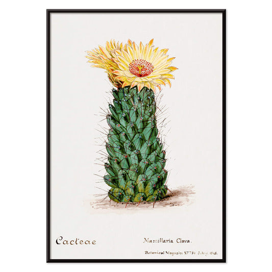
Cactus panal Póster
Artista desconocido · 1899 · Detallada lámina botánica del cactus panal con tonos verdes suaves y delicadas flores rojas
Póster desde €9 · Enmarcado desde €16
Precio habitual A partir de €6,00Precio habitual -
Cactus cojín arcoíris y azucena de Pascua Póster
Artista desconocido · 1899 · Lámina botánica detallada de cactus y azucena que contrapone formas espinosas con flores blancas
Póster desde €9 · Enmarcado desde €16
Precio habitual A partir de €6,00Precio habitual -
Cactus variados Póster
Artista desconocido · 1899 · Vivaz lámina botánica de cactus con formas variadas y flores brillantes sobre papel limpio
Póster desde €9 · Enmarcado desde €16
Precio habitual A partir de €6,00Precio habitual -
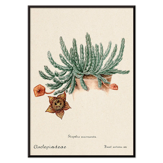
Cactus estrella Póster
Artista desconocido · 1899 · Detallada lámina botánica de Stapelia con flor moteada y papel beige
Póster desde €9 · Enmarcado desde €16
Precio habitual A partir de €6,00Precio habitual -
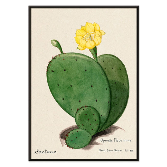
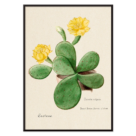
Opuntia (higo indio) Póster
Artista desconocido · 1899 · Lámina botánica detallada de opuntia con almohadillas verdes segmentadas y suave flor amarilla
Póster desde €9 · Enmarcado desde €16
Precio habitual A partir de €6,00Precio habitual -
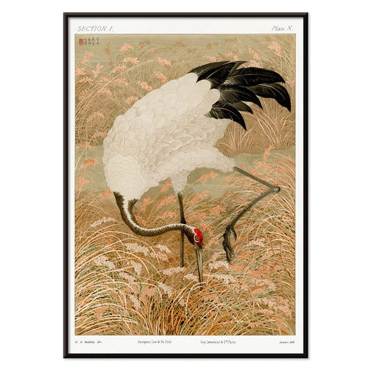
Grulla sarus en campo de arroz Póster
Artista desconocido · 1884 · Elegante lámina vintage de grulla sarus entre tallos de arroz en tonos beige cálidos
Póster desde €9 · Enmarcado desde €16
Precio habitual A partir de €6,00Precio habitual -
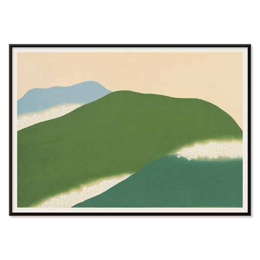
Yoshino Póster
Kamisaka Sekka · 1909 · Sereno póster japonés con colinas verdes y azules sobre beige cálido
Póster desde €9 · Enmarcado desde €16
Precio habitual A partir de €6,00Precio habitual -
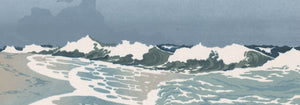
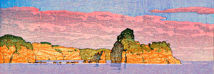
Ryoson Póster
Kamisaka Sekka · 1909 · Serena lámina artística de mar con olas estilizadas y silueta costera tranquila
Póster desde €9 · Enmarcado desde €16
Precio habitual A partir de €6,00Precio habitual -
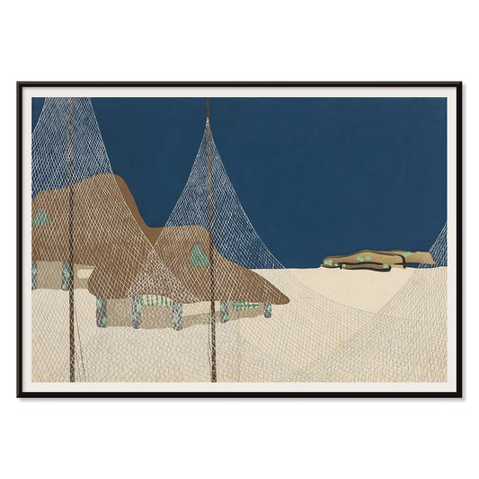
Tomoe no yuki Póster
Kamisaka Sekka · 1909 · Sereno póster de nieve con curvas negras y amplio fondo beige
Póster desde €9 · Enmarcado desde €16
Precio habitual A partir de €6,00Precio habitual -
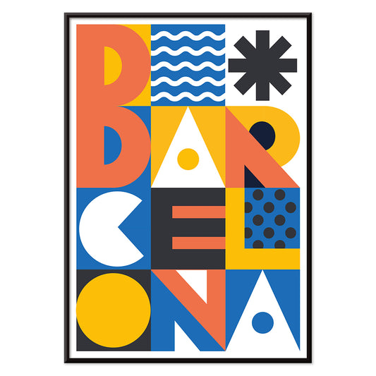
Texto de Barcelona Póster
MORYARTY · 2021 · Póster moderno de Barcelona con tipografía apilada y bloques geométricos de colores vivos
Póster desde €9 · Enmarcado desde €16
Precio habitual A partir de €6,00Precio habitual -
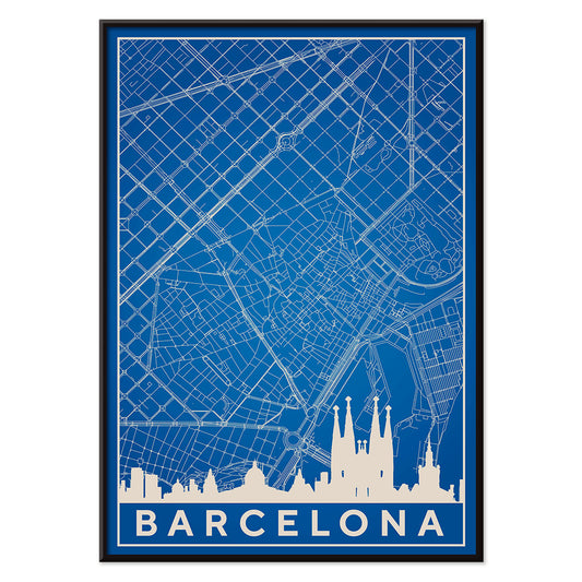
Mapa de Barcelona 2 Póster
MORYARTY · 2019 · Póster minimalista azul y blanco de Barcelona que combina silueta del skyline y calles precisas
Póster desde €9 · Enmarcado desde €16
Precio habitual A partir de €6,00Precio habitual -
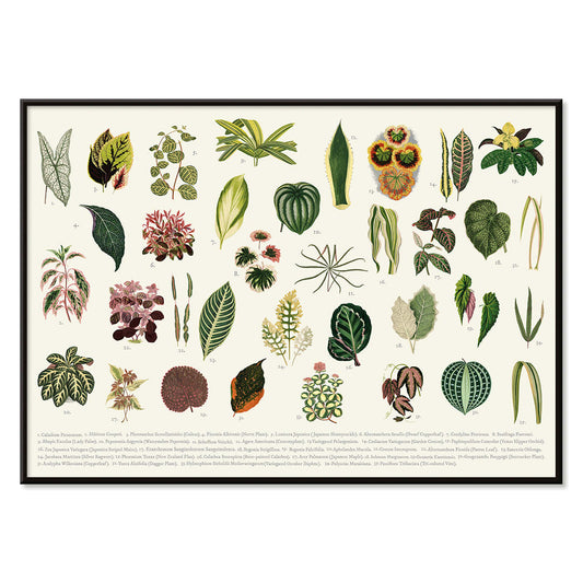
Colección de hojas Póster
Shirley Hibberd · 1855 · Delicada lámina botánica con diversas formas de hojas y finas venas sobre papel marfil cálido
Póster desde €9 · Enmarcado desde €16
Precio habitual A partir de €6,00Precio habitual -
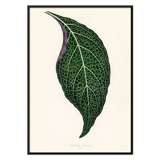
Adelaster Albivenis Póster
Shirley Hibberd · 1855 · Elegante lámina botánica de una sola hoja verde con venas púrpuras sobre fondo blanco
Póster desde €9 · Enmarcado desde €16
Precio habitual A partir de €6,00Precio habitual -
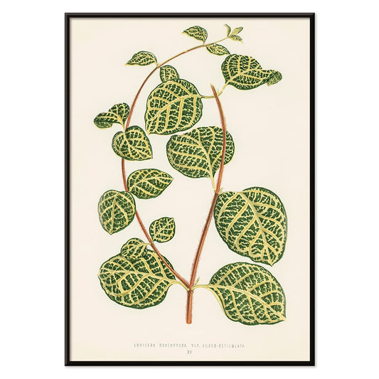
Lonicera Brachypoda Póster
Shirley Hibberd · 1855 · Elegante lámina artística de follaje y flores de madreselva sobre papel beige cálido
Póster desde €9 · Enmarcado desde €16
Precio habitual A partir de €6,00Precio habitual -
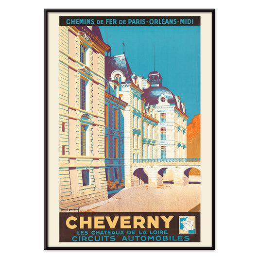
Cheverny Póster
René Roussel · 1952 · Elegante póster de viaje del castillo en tonos beige y cielo azul intenso con toques cálidos
Póster desde €9 · Enmarcado desde €16
Precio habitual A partir de €6,00Precio habitual -
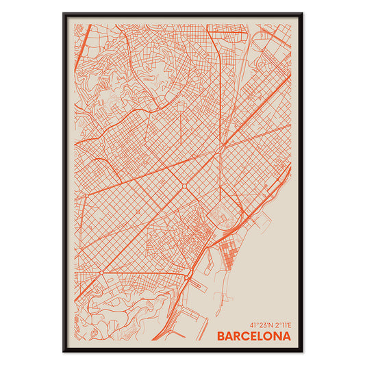
Mapa minimalista de Barcelona Póster
MORYARTY · 2018 · Póster minimalista de Barcelona con marcadas líneas rojas de calles sobre beige cálido
Póster desde €9 · Enmarcado desde €16
Precio habitual A partir de €6,00Precio habitual -
Flores de Opuntia Póster
Artista desconocido · 1899 · Lámina botánica detallada de opuntia con flores amarillas y segmentos verdes redondeados
Póster desde €9 · Enmarcado desde €16
Precio habitual A partir de €6,00Precio habitual -
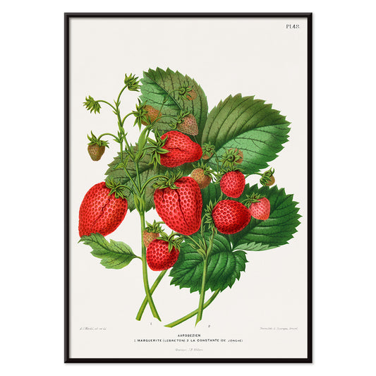
Cromolitografía de fresa Póster
Abraham Jacobus Wendel · 1879 · Lámina de fresa vibrante con detalle botánico nítido y frutas maduras
Póster desde €9 · Enmarcado desde €16
Precio habitual A partir de €6,00Precio habitual -
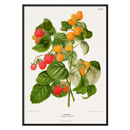
Cromolitografía de frambuesa Póster
Abraham Jacobus Wendel · 1879 · Detallada lámina botánica de frambuesa con bayas rojas maduras y hojas serradas
Póster desde €9 · Enmarcado desde €16
Precio habitual A partir de €6,00Precio habitual -
Papiers découpés 5 Póster
MORYARTY · 2023 · Rostros abstractos y coloridos en un póster de formas recortadas sobre fondo suave
Póster desde €9 · Enmarcado desde €16
Precio habitual A partir de €6,00Precio habitual -
Papiers découpés 4 Póster
MORYARTY · 1952 · Alegre póster abstracto en estilo recortado con formas rojas y azules sobre beige
Póster desde €9 · Enmarcado desde €16
Precio habitual A partir de €6,00Precio habitual -
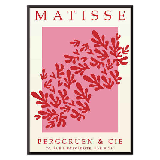
Recortes de papel 3 Póster
MORYARTY · 1949 · Póster inspirado en Matisse con hojas rojas audaces sobre blanco y rosa
Póster desde €9 · Enmarcado desde €16
Precio habitual A partir de €6,00Precio habitual -
Papiers découpés 2 Póster
MORYARTY · 2023 · Póster abstracto inspirado en Matisse con formas recortadas y colores primarios vivos
Póster desde €9 · Enmarcado desde €16
Precio habitual A partir de €6,00Precio habitual -
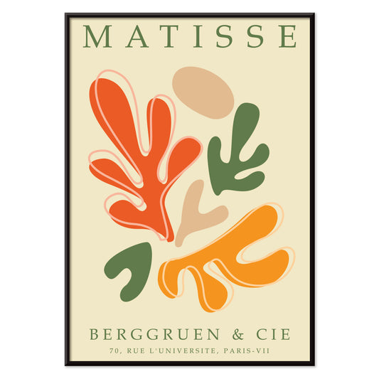
Papeles recortados 1 Póster
MORYARTY · 2021 · Vibrante póster abstracto de papel recortado con formas naranja y verde sobre base beige cálida
Póster desde €9 · Enmarcado desde €16
Precio habitual A partir de €6,00Precio habitual


36/1749 items
- Patente de cámara fotográfica Póster
- Patente de soporte para bicicleta Póster
- Patente de instrumento musical Póster
- Patente de sacacorchos Póster
- Patente de reproductor de casetes portátil Póster
- Patente de microscopio Póster
- Patente de cámara fotográfica Póster
- Yoshino Póster
- Ryoson Póster
- Tomoe no yuki Póster
- Texto de Barcelona Póster
- Mapa de Barcelona 2 Póster
- Colección de hojas Póster
- Adelaster Albivenis Póster
- Lonicera Brachypoda Póster
- Mapa minimalista de Barcelona Póster
- Papiers découpés 5 Póster
- Papiers découpés 4 Póster
- Recortes de papel 3 Póster
- Papiers découpés 2 Póster
- Papeles recortados 1 Póster
Un archivo de imágenes, no un único estilo
Todos los pósters es donde MORYARTY se lee como un gabinete de curiosidades: clásicos de lámina al lado de escenas de viaje, experimentos gráficos junto a estudios silenciosos de la naturaleza. Más que un solo movimiento, la selección sugiere una historia social de la mirada, donde la tinta sobre papel se encontró con multitudes, tiendas, salones y estaciones. A lo largo de las épocas retornan ciertos instintos: tipografías contundentes, línea expresiva y la manera en que un póster puede cambiar el ánimo de una estancia, desde la calidez de un café hasta el recogimiento de un museo. Para centrar la atención en este amplio abanico, pasea entre Publicidad y Arte Clásico y siente cómo las imágenes públicas y el gusto privado se prestan elementos mutuamente.
Cómo se imprimían los pósters y por qué importa
Muchas obras de esta colección fueron pensadas para leerse a toda velocidad. La litografía sobre piedra permitió amplios campos de color, con negros aterciopelados y un difuminado en el borde que aún resulta humano. Procesos posteriores, incluido el offset, afilaron los contornos y permitieron tiradas mayores, cambiando la forma en que el color reposa sobre la hoja. A menudo puedes identificar el método en la superficie: semitonos, tintas sobreimprimadas y ligeros desalineamientos que dan al color vintage una vibración sutil. Esos detalles no son defectos tanto como evidencia de la fabricación. Si te atraen los espacios negativos disciplinados y la línea, la estructura serena de Oriental combina bien con la claridad austera de Minimalista, donde el silencio se convierte en parte del diseño.
Usar arte mural para modelar una estancia
Por tratarse de un espectro amplio, empieza por los materiales y la luz de la habitación. En una cocina con roble, gres o terrazo, un póster botánico puede responder al veteado y a la memoria olfativa; Botánica aporta verdes que encajan con neutros cálidos. En un salón de cromo, cristal y muebles de líneas puras, la geometría de Abstracto mantiene el ambiente nítido, especialmente si repites un color de acento en textiles. Los dormitorios suelen preferir la contención: los impresos de Blanco y Negro se leen como conversación sosegada y combinan con lino, lana y lámparas bajas y cálidas.
Curaduría, emparejamientos y enmarcado entre épocas
Una pared de galería funciona mejor si tiene tempo. Empareja una lámina centrada en el texto con una composición dirigida por la imagen y deja que los márgenes marquen el ritmo. Si mezclas periodos, conserva un elemento compartido como el tono del papel, un rojo repetido o un peso de línea similar. Los marcos negros finos empujan los pósters gráficos hacia adelante; el roble claro suaviza los contrastes altos y favorece una estética nórdica. Cuelga los pósters grandes un poco más bajos de lo esperado para que la imagen encuentre la mirada, y agrupa las láminas pequeñas cerca de estantes para que los objetos repitan formas del papel. Cuando se busca una pared que parezca deliberadamente seleccionada, una obra protagonista y dos piezas secundarias suelen leerse con más claridad que una cuadrícula densa.
El placer de curiosear ampliamente
Lo que mantiene unida la colección Todos los pósters es su origen democrático: imágenes pensadas para clavarse, intercambiarse y convivir. Elige una lámina que retenga tu mirada más tiempo del previsto y construye alrededor con colores vecinos y líneas afines. Si deseas estructura mientras navegas, prueba alternar entre Pósters Verticales y Pósters Horizontales para ver cómo el formato por sí solo cambia la sensación de una pared. Para ideas de enmarcado, el perfil más sereno de Marcos ayuda a unificar épocas distintas sin borrar sus diferencias.